Timeline
A vertical timeline of entries, each with a time/year label, title, description, and optional image, connected by a scroll-activated center line with marker dots. Best for: company history, product roadmaps, "our journey", milestone and changelog sections.
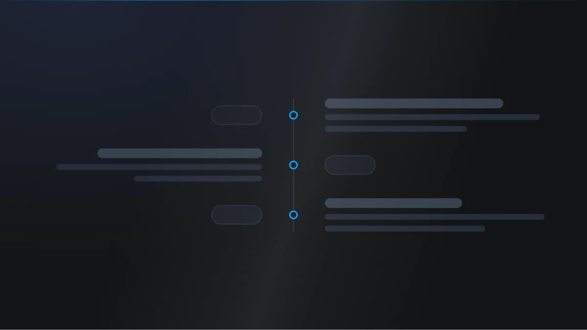
📷 Hero image
Target file: assets/img/timeline/hero.webp
A vertical timeline on a Light background with a central connector line running top to bottom and entries alternating left and right of it, each marked by a dot. Show three or four entries, each with a year label, a bold title, and a short description, plus one entry carrying an image. The upper portion of the line and its passed dots fill in the Primary color to show scroll progress, while the lower part stays a muted Tertiary tone. Captured at desktop width.
At a glance
Timeline History Scroll progress
- What it does: lists timeline entries down a central connector line. On desktop the entries alternate left and right of the line, each with a marker dot; on mobile they stack to one side. As the visitor scrolls, the line and dots switch from a "before" color to an "after" color to show progress.
- Best used for: telling a story over time - founding to today, a roadmap, or a step-by-step journey with dates.
- Not the right fit if: you want a numbered process grid rather than a dated line (use Steps), or a simple stacked FAQ (use Accordion).
- 🔗 Live demo: (add demo link)
Add it to your page
- In the HubSpot page editor, click Add and search for Timeline.
- Drag it into your page.
- Open Click to update content › Timeline and edit the first entry's Time, Title, and Description.
- Add an Image to any entry that needs one.
- Duplicate the entry to add more milestones.
- On the Style tab, set the center line and dot before/after colors, and (optionally) turn on card wrappers.
Design recipes
Each recipe is a look plus the exact fields to reproduce it.
The line and dots change color as you scroll past each entry.
📷 Result
Target file: recipe-scroll-progress-line-default.webp
The center line captured mid-scroll: the passed upper segment and its dots filled in the Primary color, the un-passed lower segment in a muted tone, with entries alternating on either side.
| Field | Set to |
|---|---|
| Timeline › Timeline center line › Before timeline color | var(--color-3) |
| Timeline › Timeline center line › After timeline color | var(--primary) |
| Timeline › Timeline center dots › After timeline dots color | var(--primary) |
| Timeline › Timeline center dots › Before timeline dots color | var(--tertiary) |
Each entry sits inside a bordered, shadowed card.
📷 Result
Target file: recipe-card-entries.webp
Each timeline entry wrapped in a bordered, softly shadowed, rounded card offset from the center line, its marker dot connecting the card to the line.
| Field | Set to |
|---|---|
| Card › Make a card | on |
| Card › Border › Show border | on |
| Card › Shadow › Card shadow | light-shadow |
| Card › Round corner › Card round corner | round-m |
A rounded time badge with its own background and border.
📷 Result
Target file: recipe-pill-year-badges.webp
Each entry's year rendered as a fully rounded pill badge with a Dark background, bordered, and set above the title. Show two or three entries so the pill styling reads clearly.
| Field | Set to |
|---|---|
| Time › Background | bg-dark |
| Time › Round corner | round-xxl |
| Time › Show border | on |
| Time › Spacing around text [desktop] | 12px |
Time, title, and description with no images or cards.
📷 Result
Target file: recipe-text-only-timeline.webp
A minimal timeline of year, title, and description text alternating around the center line, with no images and no card chrome, tightly spaced.
| Field | Set to |
|---|---|
| Card › Make a card | off |
| Content › per entry › Image | leave empty |
| Layout settings › Gap between row | tighten to taste |
"I want to..." quick reference
| Goal | Setting |
|---|---|
| Color the progress line | Timeline › Timeline center line › Before timeline color |
| Color the progress dots | Timeline › Timeline center dots › Before timeline dots color |
| Thicker connector line | Timeline center line › Timeline width |
| Bigger marker dots | Timeline center dots › Width & height of dots |
| Square dots instead of round | Timeline center dots › Round corner = round-0 |
| Wrap entries in cards | Card › Make a card |
| Pill-style year badge | Time › Background + Round corner + Spacing around text |
| Add an image to an entry | Content › Timeline item › Image |
| Crop entry images to a ratio | Image › Ratio for image |
| Tighter mobile line spacing | Timeline › [Mobile specific] - Spacing between timeline line and content |
| More vertical breathing room | Timeline › Top & bottom spacing of timeline |
| Space between entries | Layout settings › Gap between row |
Field reference
The editor is split into a Content tab and a Style tab. Groups below match the HubSpot editor. (173 fields total - expand each group as needed.)
Content tab
Click to update content - Timeline (repeater)
| Field | Type | Default |
|---|---|---|
| Time | text | Year |
| Title | text | Title |
| Description | richtext | short sample text |
| Image | image | - |
Section background settings / Drag to section name / Developer use only
Standard section background Type, an anchor Section name, and a per-module Add custom css here field.
Style tab
Color scheme
| Field | Options | Default |
|---|---|---|
| Color scheme | light / dark | light |
Drives the section's surface and text tokens. Set the background Type to none (shown as "Default (scheme)") to let the scheme supply the background colour.
Section background settings (Style)
Color (bg-* tokens), gradient, image/video overlay + position, blur, parallax, and dual radial glow (color / position / size / opacity).
Section divider + spacing settings
- Divider type:
none/shape(25 shapes) /border/shadow. - Spacing: Top (
top-xl), Bottom (bottom-xl), Left (left-m), Right (right-m). Top and Bottom also acceptcustom, which reveals Custom top / Custom bottom number fields for desktop, tablet, and mobile (defaults 80 / 60 / 40).
Layout settings
- Gap between column: responsive gap between the line side and content side.
- Gap between row: responsive gap between entries.
- Section wrapper container + Inner content container: independent width + alignment.
Card
| Field | Type | Default |
|---|---|---|
| Content alignment | choice (left / right / center) | left |
| Make a card | boolean | off |
| Background | color / gradient / custom (+ blur) | none |
| Border | toggle + width + color | off |
| Card padding | spacing (desktop/tablet/mobile) | 24px all |
| Card shadow | choice | shadow-none |
| Card round corner | choice (round-0 to round-xxl) | round-s |
Preset Settings - Time badge
Text size (show time as), color (default text-white), spacing, Background (default bg-dark), responsive padding, optional border, and round corner (default round-xxl) - so it can read as a pill or a block.
Preset Settings - Title, Description, Image
- Title: heading tag (h1 to h6, default h5), transform, color, spacing.
- Description: typo preset + color + spacing.
- Image: aspect ratio, responsive width %, round corner (default
round-xxl), shadow.
Timeline (line + dots)
| Field | Type | Default |
|---|---|---|
| Timeline center line › Timeline width | number | 4 |
| Timeline center line › Before / After timeline color | choice | var(--color-3) / var(--primary) |
| Timeline center dots › Before / After dots color | choice | var(--tertiary) / var(--tertiary) |
| Timeline center dots › Width & height of dots | number | 13 |
| Timeline center dots › Round corner | choice (round-0 to round-100, custom) | round-100 (Full) |
| Timeline center dots › Show border | boolean | off |
| Timeline center dots › Before / After dots border color | choice | var(--tertiary) / var(--tertiary) |
| Timeline center dots › Dot offset from top [desktop / mobile] | number | 24 / 24 |
| Top & bottom spacing of timeline | number | 40 |
| [Mobile specific] - Spacing between line and content | number | 36 |
Tips & gotchas
Before vs after colors tell the story
The before color is what the line/dots look like above the visitor's scroll position; the after color fills in as they scroll down. Pick a muted before (like var(--color-3)) and a brand after (like var(--primary)) for a clear progress effect.
Mobile stacks to one side
On phones the entries no longer alternate - the line runs down the left. Use [Mobile specific] - Spacing between timeline line and content to keep text from crowding the line.
Square vs round dots
The dots have their own Round corner, set to Full by default, which is what makes them circles. Set it to round-0 for square markers, or pick Custom to enter your own radius.
Frequently asked questions
Can I turn off the scroll-fill animation on the line?
No. The line and dots filling in as a visitor scrolls is handled automatically by the module's script, with no field to disable it.
Can I control which side of the line an entry appears on?
No. Entries alternate sides automatically based on their order in the list (odd/even), and there's no per-item field to force a side.
Is there a minimum number of entries?
Yes, at least one. The Timeline repeater requires a minimum of 1 item; there's no maximum.
Can some entries have an image and others not?
Yes. Show image turns the image on for the module, but the image itself is set per entry, so any entry left without one simply skips that spot.
Can I remove the date badge but keep the title and description?
Yes. Show time, Show title, Show description, and Show image are independent switches, so you can turn any of them off without affecting the others.
Can I lay the timeline out horizontally instead of as a vertical line?
No. The layout is fixed to a vertical line (it drops to a left-aligned line on mobile). There's no orientation field to switch it to a horizontal strip.
Related modules
- Steps: a numbered process grid when order matters more than dates.
- Accordion: a stacked expand/collapse list for FAQs.
- Features: a feature/benefits grid with icons.
- Section Title: a heading + intro to sit above your timeline.