Table of Contents
A sticky in-page navigation rail that lists a hand-typed set of links to sections on the page, tracks how far the reader has scrolled, and jumps to each section on click. Best for: long-form blog posts, guides, documentation-style pages, and any page with several sections where a reader benefits from a persistent map of the content.
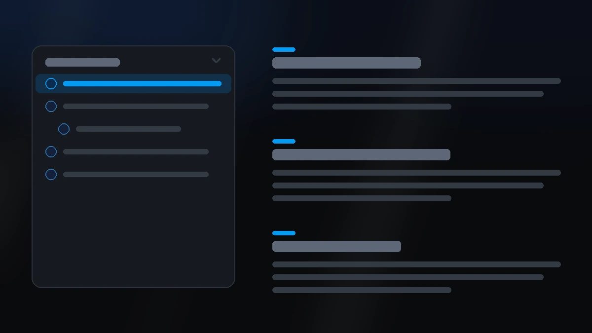
📷 Hero image
Target file: assets/img/table-of-contents/hero.webp
A two-column layout on a Light background: a sticky rail on the left listing four or five numbered items, one highlighted with a tinted accent to show the active state, and a content column on the right with matching H2/H3 headings and body text. Show one item with an expanded sub-topic indented beneath it. Captured at desktop width.
At a glance
Navigation Blog Sticky
- What it does: renders a small sticky rail beside a post's body. Its list is a repeater of hand-typed Title, Anchor id, and Description entries, and each item can nest Sub topics, which can themselves nest one further level of Sub-sub topics — three levels total, the deepest HubSpot's own field nesting allows. As the reader scrolls, the current section is highlighted and the URL hash updates without adding a history entry.
- Two ways to use it: leave every item's Description empty and it behaves as a pure nav pointing at content built elsewhere on the page (matching anchor ids exactly). Fill in a Description on any item and the module becomes self-contained — it renders its own heading + body content column alongside the rail, so there's nothing else to build.
- Best used for: a blog post sidebar, a documentation page, or any long page where readers benefit from jumping straight to a section.
- Not the right fit if: you want a horizontal in-page menu instead of a vertical rail, or a multi-page site navigation (use Simple Navigation or Megamenu for that).
- 🔗 Live demo: (add demo link)
Add it to your page
- In the HubSpot page editor, click Add and search for Table of Contents.
- Drag it into your page, typically the sidebar column of a Blog layout - Sidebar template.
- Open Click to update content › Items and add a Title, Anchor id, and (optionally) a Description for each entry.
- To point the rail at content that already exists on the page, leave Description empty and set each item's Anchor id to match that element's real
idexactly. - To make the module generate its own content, fill in a Description — a matching heading and body render automatically in a content column beside the rail.
- Turn on Add Sub Topics on any item to nest a Sub topics repeater beneath it (and again on a sub topic for one further Sub-sub topics level).
- On the Style tab, set Marker style (Content tab, under Marker), pick a color scheme, and adjust List item, List item - Card UI settings, and Layout settings to match your page.
Design recipes
Each recipe is a look plus the exact fields to reproduce it.
A plain numbered rail pointing at a blog post body built elsewhere - no self-contained content.
📷 Result
Target file: recipe-sidebar-nav.webp
A numbered rail in a bordered card, sitting in the sidebar column next to a real blog post body. No sub topics, all descriptions left empty.
| Field | Set to |
|---|---|
| Content › Marker › Marker style | number |
| Every item's Description | left empty |
| Every item's Anchor id | matches the post's real heading ids |
Fill in Descriptions and the module builds its own headed sections - no separate content module needed.
📷 Result
Target file: recipe-self-contained.webp
The rail beside a generated content column: each item's title as an H2, its description as body copy below, with one item's sub topics rendering as indented H3 sections.
| Field | Set to |
|---|---|
| Every item's Description | filled in (richtext) |
| Some items' Add Sub Topics | on |
| Style › Preset settings › Main title / Sub-topic title / Sub-sub topic title | set heading size, bold, colour as needed |
A quieter look: dots instead of numbers, and the list on plain background instead of a card.
📷 Result
Target file: recipe-dot-no-card.webp
A rail with small accent-colored dots before each item, no card background or border, active item picked out only by its accent text colour.
| Field | Set to |
|---|---|
| Content › Marker › Marker style | dot |
| Style › List item - Card UI settings (the checkbox) | off |
| Style › Preset settings › List item › List item marker › Dot round corner | round-100 (Full) |
"I want to…" quick reference
| Goal | Setting |
|---|---|
| Put the rail on the right instead of the left | Content › Click to update content › List item on = right |
| Point a link at a heading built elsewhere on the page | Items › (item) › Anchor id, matching that element's real id exactly |
| Make the module generate its own content | Items › (item) › Description - fill it in and a full content column renders automatically |
| Break an item into sub-sections | Items › (item) › Add Sub Topics, then fill in Sub topics (and again for Sub-sub topics) |
| Change the marker before each item | Content › Marker › Marker style = number, dot, or none |
| Zero-pad the numbers ("01" instead of "1.") | Marker › Number format = zero_padded |
| Let readers collapse the list | Content › Behaviour › Collapsible |
| Start collapsed on phones but open on desktop | Behaviour › Open by default [desktop] on, [mobile] off |
| Style a list item's text per nesting level | Style › Preset settings › List item › Main title / Sub-topic title / Sub-sub topic title |
| Give the active (currently scrolled-to) item its own look | Style › Preset settings › List item › Active list item color / Make active list item bold |
| Style the marker itself (gap, dot size, dot color) | Style › Preset settings › List item › List item marker |
| Line up the marker and label text vertically | List item marker › Vertical alignment with marker and text (Start / Middle / End) |
| Turn the card look off | Style › List item - Card UI settings (the checkbox) |
| Wrap the self-contained content column in a card too | Style › Description - Card UI settings (the checkbox) |
Field reference
The editor is split into a Content tab and a Style tab. (271 fields total - grouped below to match the HubSpot editor; expand each group as needed.)
Content tab
Click to update content
| Field | Type | Default |
|---|---|---|
| Icon | choice (no icon / library / upload / svg) | no icon |
| Show title | boolean | on |
| Title | text | "On this page" |
| List item on | choice (left / right) | left |
| Items (repeater) | Title, Anchor id, Description, Add Sub Topics → Sub topics (same shape, one level deeper) | one starter item |
Marker
| Field | Type | Default |
|---|---|---|
| Marker style | choice (number / dot / none) | number |
| Number format | choice (decimal / zero-padded) | decimal |
Behaviour
| Field | Type | Default |
|---|---|---|
| Collapsible | boolean | off |
| Open by default [desktop] / [mobile] | boolean | on / off |
| Smooth scroll to section | boolean | on |
| Sticky offset | number (px) | matches header clearance |
| Update URL hash on click | boolean | off |
Section background settings / Drag to section name / Developer use only
Standard shared fields: background type (none / colour / image / video), an anchor Section name, and a per-instance Add custom css here.
Style tab
Color scheme, Section background, divider & spacing settings
The standard shared block every module uses: light / dark scheme, colour or gradient background with optional radial glow, section divider (shape / border / shadow), and responsive top/bottom/left/right spacing.
Layout settings
- Inner content container: caps how wide the section gets.
- Width [desktop] / [tablet]: the rail column's own width.
- Gap between columns [desktop/tablet/mobile]: space between the rail and the content column.
- Spacing settings: Spacing between main items / sub items, per breakpoint - uses
gap, so it never stacks on top of a description's own spacing.
List item - Card UI settings
A checkbox (default on) plus a group for Background (with blur), Border, Round corner, and responsive Card padding - the exact same pattern as Pricing's card system, wrapping the rail.
Description - Card UI settings
The same pair again, default off, wrapping the self-contained content column instead of the rail.
Preset settings › Title groups
Four independent groups, each with Show title as (H2-H6), text transform, Make font bold, Color, and Spacing below element: List items title (the rail's own heading), Main title, Sub-topic title, Sub-sub topic title (the self-contained content column's headings - tag itself stays fixed at h2/h3/h4 for a valid outline).
Preset settings › Description
Font size (desktop/tablet/mobile), Make font bold, and Color for every item/sub-topic/sub-sub-topic's Description richtext - one shared look.
Preset settings › List item
- Main title / Sub-topic title / Sub-sub topic title: independent Show ... as (Default / Custom font size), font size per breakpoint, Make font bold, and Color per nesting level - Sub-topic and Sub-sub topic title also carry their own indent field.
- Make active list item bold / Active list item color: the one shared control for whichever item is currently scroll-spy active, at any level.
- Gap between items.
- List item marker: Gap between marker and label, Vertical alignment with marker and text (Start/Middle/End - works for Number and Dot), Dot marker size, Dot color, Dot round corner, and Active dot color - all hidden when Marker style is None, the dot-specific fields further limited to Marker style = Dot.
Preset settings › Collapsible icon
The collapse/expand toggle's own icon: size, spacing around it, icon color, background, border radius, and border - the same field set as Section Title's Top icon.
Tips & gotchas
Two modes, one field
Whether the module is nav-only or self-contained is decided entirely by whether Description is filled in on any item - there's no separate toggle. Leave every Description empty for nav-only; fill in even one and the content column appears automatically.
Anchor ids must match exactly
In nav-only mode, Anchor id has to match the target element's real id attribute exactly - lowercase letters, numbers, and underscores, starting with a letter. A mismatch means the link scrolls nowhere.
Number markers only count main items
With Marker style set to Number, sub topics and sub-sub topics show no marker at all - only top-level items are numbered, so the sequence never skips because of nested items.
Frequently asked questions
Can I use this module without any real page content to point at?
Yes. Fill in a Description on any item and the module renders its own heading and body content column - you don't need a separate content module on the page at all.
How deep can the list nest?
Three levels: Items → Sub topics → Sub-sub topics. That's the deepest HubSpot's own field-group nesting allows.
Does the active item's highlight follow the reader's scroll automatically?
Yes. A scroll-spy watches the page and highlights whichever section is currently in view, with no field required to turn it on.
Can I style the marker and dot color independently of the item text?
Yes. List item marker (Style › Preset settings › List item) has its own Gap, Vertical alignment, Dot size, Dot color, and Dot round corner fields, separate from the Main/Sub-topic/Sub-sub topic title text controls.
Why don't I see the Dot-specific fields?
They only appear when Content › Marker › Marker style is set to dot. Switch Marker style and re-open the group.
Related modules
- Simple Navigation: a horizontal top-of-page nav, for multi-page site navigation instead of in-page jumps.
- Section Title: a heading + intro block, source of the Collapsible icon's field set.
- Accordion: a stacked expand/collapse list, if you want hidden detail instead of a persistent nav rail.
- Blog layout - Sidebar: the blog template this module most often sits inside.