Tab
A tabbed content switcher: a row or sidebar of tab buttons that reveal one content panel at a time, where every panel uses one of four layouts. Best for: feature breakdowns, plan comparisons, product-line switchers, FAQ-by-category, "how it works" by stage.
📷 Hero image
Target file: assets/img/tab/hero.webp
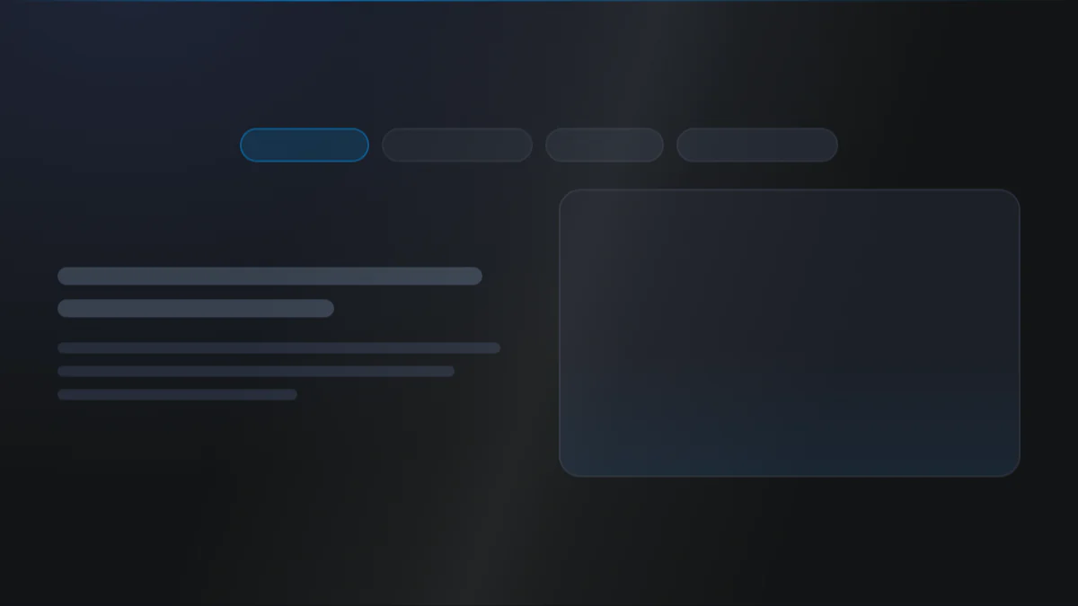
A horizontal row of three or four tab buttons along the top, with the active tab highlighted in the Secondary color and the rest muted, sitting above a single content panel. The panel below shows a title, a short description, and a supporting image on a Light background. Include a subtle divider between the tab bar and the panel. Captured at desktop width.
At a glance
Tabs Switcher 4 layouts
- What it does: builds an accessible tab interface (a list of tab buttons plus one panel per tab). Tabs run horizontally along the top or vertically down a side, and collapse to a styled mobile dropdown below a chosen breakpoint. Every tab shares one content layout, chosen once: Description, Two column image + description, Image content grid, or Image overlay grid.
- Best used for: grouping related content under selectable headings so visitors only see one section at a time.
- Not the right fit if: you want all items visible in a stack that expands in place (use Accordion), or a simple feature grid with no switching (use Features).
- 🔗 Live demo: (add demo link)
Add it to your page
- In the HubSpot page editor, click Add and search for Tab.
- Drag it into your page.
- Open Click to update content and pick a Tab content layout (this applies to every tab).
- Under Tabs, edit each tab's Title and fill in the fields for the layout you chose.
- Optionally turn on Add icon to tab per tab.
- On the Style tab, set Tab orientation, tab button colors (simple + active states), and the content panel look.
Design recipes
Each recipe is a look plus the exact fields to reproduce it.
Buttons along the top with a fade transition between panels.
📷 Result
Target file: recipe-horizontal-fade-default.webp
A top tab bar with the active tab in the Secondary color, showing a single description panel below it mid-crossfade between two tabs.
| Field | Set to |
|---|---|
| Layout settings › Tab layout › Tab orientation | horizontal |
| Tab layout › Tab content transition | fade |
| Content › Tab content layout | description |
Tabs down the left with a wider content column.
📷 Result
Target file: recipe-vertical-sidebar-tabs.webp
A narrow column of stacked tab buttons down the left side with the active one highlighted, beside a wider content panel taking three quarters of the width.
| Field | Set to |
|---|---|
| Tab layout › Tab orientation | vertical-left |
| Vertical layout › Tabs : Content ratio | 1fr 3fr |
| Vertical layout › Vertical alignment | start |
Rounded buttons with a filled active state.
📷 Result
Target file: recipe-pill-tabs-filled-active.webp
Fully rounded pill-shaped tab buttons in a row, with the active pill filled in the Secondary color and its label in Light text, the rest transparent.
| Field | Set to |
|---|---|
| Tab title › Round corner › Tab title roundness | round-xxl |
| Tab title › Active state › Background color | var(--secondary) |
| Tab title › Active state › Color | var(--white) |
The classic bottom-border active indicator.
📷 Result
Target file: recipe-underline-tabs.webp
A row of plain text tab labels with the active one marked by a Secondary color underline beneath it, no button fills or borders elsewhere.
| Field | Set to |
|---|---|
| Tab title › Border › Show as bottom border only | on |
| Tab title › Active state › Border color | var(--secondary) |
| Tab title › Simple state › Background color | transparent |
"I want to..." quick reference
| Goal | Setting |
|---|---|
| Set what every tab shows | Content › Tab content layout |
| Tabs on the side instead of top | Layout settings › Tab layout › Tab orientation = vertical left/right |
| Set side-tab width ratio | Vertical layout › Tabs : Content ratio |
| Animate panel switches | Tab layout › Tab content transition + duration |
| Add icons to tabs | Content › Tabs › Add icon to tab |
| Filled active tab | Tab title › Active state › Background color |
| Underline-style active tab | Tab title › Border › Show as bottom border only |
| Make tabs fill the bar evenly | Tab title › Tab in full width |
| Collapse tabs to a dropdown on mobile | Tab title › Responsive settings › Collapse tabs to dropdown below |
| Style the content panel | Tab content › Background / Border / Shadow / Round corner |
| Add a button in a panel | Content › the layout's group › Add button |
| Wrap everything in a box | Outer box › Outer box |
| Full-width buttons on mobile | Buttons › Make button full width [mobile] |
| Image grid columns per breakpoint | Image content layouts › Columns |
Field reference
The editor is split into a Content tab and a Style tab. Groups below match the HubSpot editor. (301 fields total - expand each group as needed.)
Content tab
Click to update content
- Tab content layout: sets the layout for ALL tabs:
image_content/image_overlay_content/two_column_image_description/description(defaultdescription). - Tabs (repeater): per tab - Add icon to tab + source (library or SVG), Title, and the content group for the chosen layout.
Each layout group carries a Title, Description, optional Image, and an optional Button (btn-1 to btn-8 or simple link, with optional icon).
Section background settings / Drag to section name / Developer use only
Standard section background Type (none / color / gradient / image / video), an anchor Section name, and a per-module Add custom css here field.
Style tab
Color scheme
| Field | Options | Default |
|---|---|---|
| Color scheme | light / dark | light |
Drives the section's surface and text tokens. Set the background Type to none (shown as "Default (scheme)") to let the scheme supply the background colour.
Section background settings (Style)
Color (bg-* tokens), gradient, image/video overlay + position, blur, parallax, and dual radial glow (color / position / size / opacity).
Section divider + spacing settings
- Divider type:
none/shape(25 shapes) /border/shadow. - Spacing: Top (
top-xl), Bottom (bottom-xl), Left (left-m), Right (right-m). Top and Bottom also acceptcustom, which reveals Custom top / Custom bottom number fields for desktop, tablet, and mobile (defaults 80 / 60 / 40).
Layout settings
- Tab layout: orientation (
horizontal/vertical-left/vertical-right), transition (none/fade/slide-up/slide-left), duration (ms). - Vertical layout: Tabs : Content ratio, per-breakpoint column gap, vertical alignment.
- Section wrapper container + Inner content container: independent width control + alignment.
Per-layout grids
- Image content layouts: responsive columns (default 3 / 2 / 1) + gap.
- Two column - image description layouts: image:description ratio, stacking breakpoint, arrangement, vertical alignment, per-breakpoint gap.
- Image overlay content layouts: responsive columns + gap.
Preset Settings - Tab title
| Field | Type | Default |
|---|---|---|
| Alignment of tabs | choice | justify-start |
| Show tab title as | choice (h3-h6 / typo / p) | h6 |
| Simple state | color / background / border | transparent bg |
| Active state | color / background / border (+ width) | var(--secondary) bg |
| Show bottom border | boolean | off |
| Tab title roundness | choice (round-0 to round-xxl / custom) | round-m |
| Gap between tabs | choice (gap-0 to gap-4xl) | gap-xl |
| Tab in full width | boolean | off |
Responsive settings collapse the bar to a styled <select> below a chosen breakpoint, with its own background, padding, round corner, shadow, text color, border, full-width toggle, and arrow color/size.
Preset Settings - Tab content + images
- Tab content: background (color/gradient/custom), border, responsive padding, shadow, round corner.
- Simple image: ratio or custom height (per breakpoint), round corner, shadow, spacing.
- Overlay image: content padding (per breakpoint), round corner, shadow, content background.
- Title / Description: tag, transform, color, spacing.
Preset Settings - Links & buttons
- Simple link: color, icon size and gap, underline + offset, bold.
- Buttons: icon-text gap, spacing between buttons, and Make button full width [mobile].
Outer box
Optional wrapper: Outer box + background (color/gradient + blur), border, responsive padding, round corner (default round-l), and shadow.
Tips & gotchas
Round corner is showing but nothing changes?
With the Overlay card style the image becomes the card background, so the image's own Round corner has no effect even though the field is still listed. Set the corner from the Overlay card settings group instead.
With Content only card padding the image sits flush to the card edges and takes the card's radius, so Round corner is hidden there.
The layout is set once
Tab content layout applies to every tab in the module. Pick the pattern first, then fill each tab. If you need different layouts side by side, use two Tab modules.
Vertical tabs fall back on mobile
Vertical orientation reflows on small screens. Set Collapse tabs to dropdown below so the tab bar becomes a clean mobile <select>.
Underline vs filled
For the classic underline style, turn on Show as bottom border only and keep the simple-state background transparent. For pill tabs, set an active Background color and a rounded Tab title roundness instead.
Frequently asked questions
Can different tabs use different content layouts?
No. Content › Tab content layout applies to every tab in the module at once. Pick the layout first, then fill in each tab. If you need two different layouts side by side, use two separate Tab modules.
How do I put the tabs on the side instead of along the top?
Set Layout settings › Tab layout › Tab orientation to vertical-left or vertical-right, then use Vertical layout › Tabs : Content ratio to control how wide the tab column is against the content panel.
Why did my vertical tabs turn into a plain stack on mobile instead of staying vertical?
Vertical orientation reflows on small screens rather than keeping a side column. Turn on Tab title › Responsive settings › Collapse tabs to dropdown below and set a breakpoint so the tab bar becomes a clean mobile <select> instead.
How do I animate the switch between panels?
Set Tab layout › Tab content transition to fade, slide-up, or slide-left (or none to disable it) and set a duration in milliseconds.
Can I add a button inside a tab's content panel?
Yes. Every layout's content group includes an optional Button field (btn-1 to btn-8 or a simple link, with an optional icon), so each tab can carry its own CTA.
How many columns can the image grid layouts show?
Up to 6 on desktop, tablet, and mobile independently (default 3 / 2 / 1), set in Style › Per-layout grids › Columns for the Image content and Image overlay content layouts.
Why doesn't changing the image's round corner do anything?
With the Image overlay layout, the image becomes the card background, so the corner comes from Overlay card settings instead of the image's own Round corner field. With Content-only card padding the image sits flush to the card edges and takes the card's own radius, so Round corner is hidden there too.
Related modules
- Accordion: a stacked expand/collapse list when you want everything on one page.
- Features: a simple feature grid with icons and links.
- Steps: a numbered process grid.
- Content and Media: a single image-beside-text block without tabs.