Single Column Banner - Simple
A single centered hero: caption, tag, title (with highlight / stroke / image-fill), description, buttons, an optional video button, an optional embedded form, and an optional scroll-down arrow. Best for: page hero headers, landing-page banners, campaign intros, full-viewport heroes.
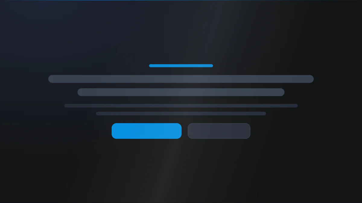
📷 Hero image
Target file: assets/img/single-column-banner-simple/hero.webp
A single centered hero block at the top of a landing page, captured edge to edge. Show a small tag pill, a large bold headline with one word highlighted in the Secondary color, a short supporting paragraph, and two buttons side by side (a solid Primary button and a lighter secondary button) - all stacked and centered over a dark background (deep Dark navy, or the navy-to-purple Gradient 1). Captured at desktop width.
At a glance
Hero Centered Full-width
- What it does: stacks one centered hero block (caption title, tag pill, main title, description, button group, optional play button, optional embedded form, optional scroll-down arrow) over a color / gradient / image / video / radial-gradient background with overlays, particle effects, and dual radial glows.
- Best used for: a homepage hero, a landing-page banner, a campaign intro, or a full-viewport splash.
- Not the right fit if: you need multiple rotating messages (use Single Column Banner - Slider), a text-and-media split (use Multi Column Banner - Simple), or a dedicated lead-capture form beside the copy (use Banner with Form).
- 🔗 Live demo: (add demo link)
Add it to your page
- In the HubSpot page editor, click Add and search for Single Column Banner - Simple.
- Drag it to the top of your page (heroes usually sit first).
- Open Click to update content and type your Title.
- Turn on Show description and Add button to fill out the hero, then add button labels and links.
- Optionally enable Show tag, Show caption title, a video button, an embedded form, or a drag to section arrow.
- Switch to the Style tab to set the background, spacing, alignment, and element typography.
Design recipes
Each recipe is a look plus the exact fields to reproduce it.
Caption, title, description, and buttons stacked and centered.
📷 Result
Target file: recipe-centered-text-hero-default.webp
The hero with caption, title, description, and a button row all centered in a single column. Capture the whole hero at desktop width so the centered stack reads clearly.
| Field | Set to |
|---|---|
| Content › Show title | on |
| Content › Show description | on |
| Content › Add button | on |
| Layout settings › Alignment › Title | center |
One word in the title styled differently from the rest.
📷 Result
Target file: recipe-highlighted-word-title.webp
The hero headline with a single word treated differently from the rest - either underlined or filled with the Gradient 1 color. Frame tight on the title so the highlighted word is obvious.
| Field | Set to |
|---|---|
| Content › Title | wrap one word in <span> tags |
| Title › Highlight style | line_under_word or custom_gradient |
| Title › Custom highlight word gradient color | --gradient-1 |
A play button that opens a video in a modal.
📷 Result
Target file: recipe-hero-with-video-button.webp
The hero with a circular play button below the copy, its icon in the Primary color. Show the button clearly so the video affordance is visible. Desktop width.
| Field | Set to |
|---|---|
| Content › Want to add a video button? | youtube / vimeo / hubspot |
| Content › YouTube video ID (or Vimeo video ID) | your video ID only |
| Video button › Icon color | Primary |
A full-screen banner with an animated background.
📷 Result
Target file: recipe-full-viewport-particle-hero.webp
The hero filling the full browser height on a dark background scattered with animated particles, the content vertically centered. Capture at desktop width so the full-height particle effect is clear.
| Field | Set to |
|---|---|
| Section background › Particle effect | default / snow / nasa |
| Layout settings › Make section in full viewport | on |
| Layout settings › Vertical alignment | center |
| Layout settings › Viewport height [mobile] | available_in_tablet_remove_in_mobile |
"I want to..." quick reference
| Goal | Setting |
|---|---|
| Add an eyebrow tag pill | Content › Show tag + Tag (+ Add icon to tag) |
| Highlight a word in the title | Wrap it in <span> + Title › Highlight style |
| Outline the title | Title › Text style = stroke |
| Image-filled title | Title › Text style = image_text (+ image) |
| Add a video play button | Content › Want to add a video button? = youtube / vimeo / hubspot |
| Add a scroll-down arrow | Content › Drag to section arrow + Section name |
| Make it full-screen height | Layout settings › Make section in full viewport |
| Keep full height off on mobile | Layout settings › Viewport height [mobile] |
| Particle background | Section background › Particle effect (default / snow / nasa) |
| Radial fade background | Section background › Type = radial gradient |
| Full-width buttons on mobile | Button › Buttons › Make button full width [mobile] |
Field reference
The editor is organized into a Content tab and a Style tab. Full field lists are grouped exactly as they appear in HubSpot. (254 fields total - expand each group as needed.)
Content tab
Section background settings
| Field | Type | Options | Default |
|---|---|---|---|
| Type | choice | none / color / image / video / radial_gradient | color |
| Upload background image | image | - | - |
| Video | file | - | - |
| Particle effect | choice | no_effect / default / snow / nasa | no_effect |
Each particle mode (default, snow, NASA) has its own color, opacity, amount, size, and speed; snow also has a fall direction.
Click to update content
| Field | Type | Default |
|---|---|---|
| Add caption title / Caption title | boolean / text | off |
| Add tag / Tag | boolean / text | off |
| Add icon to tag / Tag icon | boolean / icon | Star |
| Add title / Title | boolean / text | on |
| Add description / Description | boolean / richtext | off |
| Add button / Buttons | boolean / group | off |
| Want to add a video button? | choice | no_video |
| Add drag to section arrow / Section name | boolean / text | off |
Buttons (per button): Type (link / cta / drag_to_section), Link/CTA/Section name, Style (btn-1 to btn-8, default btn-1), Title, optional Icon.
Developer use only
Add custom css here: per-module CSS injection field.
Style tab
Color scheme
| Field | Options | Default |
|---|---|---|
| Color scheme | light / dark | light |
Drives the section's surface and text tokens. Set the background Type to none (shown as "Default (scheme)") to let the scheme supply the background colour.
Section background settings
- Color: Primary, Secondary, Tertiary, Light, Dark, White, Black, White transparent, or a custom color or custom gradient (default
bg-primary). - Image / Video: overlay (none / solid / gradient, plus a custom overlay color or gradient) and focal position.
- Radial gradient: direction plus a fade color and a background color.
- Blur: toggle + amount. Parallax: toggle + scale + speed.
- Radial glow (x2): two soft glows, each with a color (default Secondary / Tertiary), one of 9 positions, size, and opacity.
- Background pattern: toggle Add pattern, then choose a style (Grid, Dots, Diagonal lines, Diagonal cross, Circuit board), its colour and opacity, a tile size, and a fade (none / top / bottom / left / right / edges) with a fade amount. Hidden when Type is Image or Video, because a pattern needs a flat surface to read against.
Section divider settings
Divider type: none / shape / border / shadow.
- Border divider: from top/bottom/both, width, color (default Tertiary).
- Shadow divider: regular / light / dark / custom shadow with x/y/blur/spread/color.
- Shape divider: 25 shapes, top/bottom/both, flip/invert, color or gradient, responsive heights.
Section spacing settings
| Field | Options | Default |
|---|---|---|
| Top | top-y-0 to top-4xl | top-xl |
| Bottom | bottom-y-0 to bottom-4xl | bottom-xl |
| Left | left-x-0 / left-m / left-l / left-xl | left-m |
| Right | right-x-0 / right-m / right-l / right-xl | right-m |
Top and Bottom also accept custom, which reveals Custom top / Custom bottom number fields for desktop, tablet, and mobile (defaults 80 / 60 / 40).
Layout settings
- Section wrapper container: default / full-width / 8 presets 384px to 1152px / custom (per breakpoint) + block alignment.
- Inner content container: independent inner width + alignment.
- Alignment: independent center/left/right for tag, caption, title, description, button, video button, and form.
- Maximum content width for element: per-element width cap + alignment.
- Make section in full viewport: vertical + horizontal alignment, plus mobile viewport-height behavior.
Preset Settings - Title (key fields)
| Field | Type | Default |
|---|---|---|
| Show title as | choice (custom / h1-h6) | h1 |
| Font size [desktop / tablet / mobile] | number | 105 / 70 / 55 |
| Text transform | choice | as_it_is |
| Color | choice (tokens / custom / gradient) | default |
| Spacing under element | Default / 0 / S / M / L / XL / 2XL / 3XL / 4XL | Default |
| Highlight style | none / underline / custom color / gradient / different font | none |
| Text style | none / stroke / image_text | none |
Other element groups: Caption title, Tag, Description, Button, Video button, Form, and Drag to section arrow, each with its own color, spacing, transform, and sizing fields.
Form (embedded)
Optional HubSpot form with a Style preset (form-1 / form-2 / form-3, default form-2), plus own background, spacing override, round corner (default --round-xl), border, and shadow.
Tips & gotchas
Highlight only wraps here
The <span> word highlight works only inside the Title field. Wrap the exact word you want styled, then pick a Highlight style.
Overlays keep text readable
On image or video backgrounds, keep an Overlay color type (or Overlay color type) so your title and description stay legible over busy backgrounds.
Full-viewport on mobile
Full-viewport height can feel cramped on phones. Use Viewport height [mobile] to drop the fixed height on smaller screens.
Frequently asked questions
How do I highlight one word in the title?
Wrap that word in <span>...</span> inside Content › Title, then set Style › Preset Settings - Title › Highlight style to underline, custom color, gradient, or a different font. Only the wrapped word takes the treatment.
Can the highlighted word use a different font from the rest of the title?
Yes. Highlight style includes a "different font" option alongside underline, custom color, and gradient, so the wrapped word can carry its own typeface.
Can I combine the stroke or image-fill title style with a highlighted word?
No. Text style (stroke / image-fill) only renders when Highlight style is set to none. Wrapping a word and picking a highlight style takes over the title instead of the whole-title stroke or image fill.
Can this hero rotate through multiple messages?
No, this module renders one fixed hero. For rotating slides use Single Column Banner - Slider instead.
Why is my title hard to read over my background image?
Add an Overlay color type under Section background settings and pick a solid or gradient overlay color. Image and video backgrounds are busy enough that text needs that darkening or tinting layer to stay legible.
How do I stop full-viewport height feeling cramped on mobile?
Set Layout settings › Viewport height [mobile] to drop the fixed full-screen height on smaller screens, so the hero falls back to its normal content height there instead.
What styles can I apply to the embedded form?
The Form group has a Style preset with three options, form-1, form-2, or form-3 (default form-2), plus its own background, spacing override, round corner, border, and shadow on top of that.
How do I add a scroll-down arrow that jumps to the next section?
Turn on Content › Add drag to section arrow and set the Section name. That name must match the Section name field on the section you want to scroll to, since that's what gives the arrow a target to jump to.
Related modules
- Single Column Banner - Slider: the same hero as a rotating multi-slide carousel.
- Multi Column Banner - Simple: when you need text beside an image, video, or form.
- Banner with Form: a hero built around a dedicated lead-capture form.