Portfolio
A filterable grid of project / work cards - image, optional tag badge, title, and description - with category filter buttons, a responsive filter dropdown, and a Load more button. Best for: portfolio and case-study galleries, project showcases, work-sample grids, "our projects" sections with category filtering.
📷 Hero image
Target file: assets/img/portfolio/hero.webp
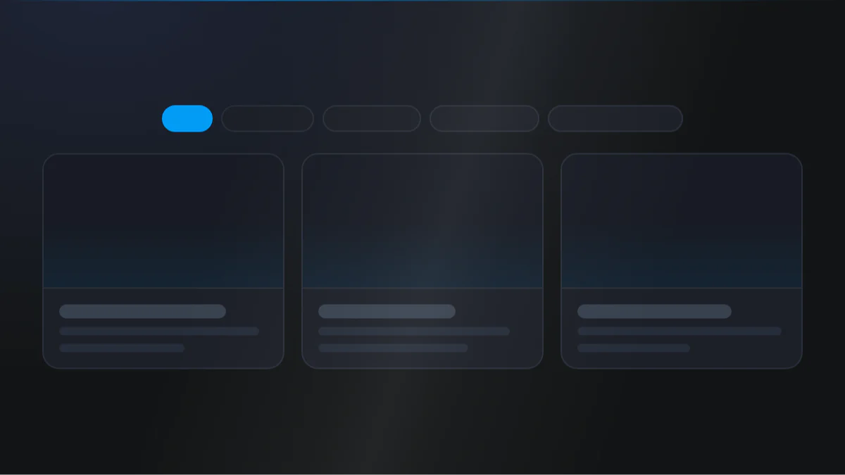
A filterable project gallery on a Light background: a row of category filter buttons across the top with the active filter highlighted in the Secondary color, above a three-column grid of project cards. Each card shows a project image with a small tag badge in the corner, a bold title, and a short description. Captured at desktop width.
At a glance
Portfolio Gallery Filterable
- What it does: renders a responsive grid of project cards. Cards can be grouped into named categories and filtered live with a button bar (which collapses into a dropdown on small screens), or supplied as a flat list. Each card has an image, an optional tag badge, a title, and a rich-text description, and can be made clickable.
- Best used for: a gallery of projects, case studies, or work samples where visitors filter by category and reveal more in batches.
- Not the right fit if: you want a simple image gallery without titles or filtering (use Image Box) or a set of feature cards (use Features).
- 🔗 Live demo: (add demo link)
Add it to your page
- In the HubSpot page editor, click Add and search for Portfolio.
- Drag it onto your page where you want the gallery.
- Choose a Card style (
simpleoroverlay). - With the filter bar on, add categories under Portfolio (categorized), each holding its own Portfolio card list. With it off, use the flat Portfolio cards list instead.
- Fill in each card: image, title, description, optional Show tag, and optional Applied link on card?.
- In the Style tab, set Layout › Columns per breakpoint, and optionally turn on the Load more button.
Design recipes
Each recipe is a look plus the exact fields to reproduce it.
Category filter buttons above a 3-up grid.
📷 Result
Target file: recipe-filtered-grid-button-bar.webp
A horizontal category filter bar led by an "All" button, the active filter in the Secondary color, above a three-column grid of project cards.
| Field | Set to |
|---|---|
| Category › Show category filter bar | on |
| Content › Card style | simple |
| Layout › Columns › Desktop / Tablet / Mobile | 3 / 2 / 1 |
| Category › "All" button label | All |
Bordered, padded cards with a caption beneath the image.
📷 Result
Target file: recipe-simple-cards.webp
Project cards with the image on top and a bordered, padded, softly shadowed caption area beneath holding the title and description.
| Field | Set to |
|---|---|
| Content › Card style | simple |
| Simple card › Make a card | on |
| Simple card › Shadow › Card shadow | light-shadow |
| Simple card › Round corner › Card round corner | round-m |
Image-filling cards with a tint and caption over them.
📷 Result
Target file: recipe-overlay-cards.webp
Cards where the image fills the whole tile under a dark overlay tint, with the title and description sitting over the image and anchored to the bottom.
| Field | Set to |
|---|---|
| Content › Card style | overlay |
| Overlay card › Vertical content position | bottom |
| Overlay card › Overlay › Overlay | Default |
Show a first batch, then reveal more on click.
📷 Result
Target file: recipe-load-more.webp
A first batch of six project cards with a centered "Load more" button styled as btn-1 beneath the grid.
| Field | Set to |
|---|---|
| Load more › Show "Load more" button | on |
| Load more › Initial items shown | 6 |
| Load more › Items revealed per click | 6 |
| Style › Load more button › Style | btn-1 |
"I want to..." quick reference
| Goal | Setting |
|---|---|
| Filter projects by category | Content › Category › Show category filter bar + add categories under Portfolio (categorized) |
| Flat gallery with no filtering | Content › Category › Show category filter bar off (uses Portfolio cards list) |
| Image-fill cards with text over them | Content › Card style = Overlay |
| Bordered / padded cards | Content › Card style = Simple, then Simple card › Make a card |
| Caption at the top of an overlay card | Overlay card › Vertical content position = Top |
| Corner "Featured" badge | Card › Show tag + Style › Tag › Placement = On image |
| Tag as a subtitle above the title | Style › Tag › Tag placement = Below image |
| One project per row on mobile | Layout › Columns › Mobile = 1 |
| Reveal cards in batches | Content › Load more › Show "Load more" button + Initial items shown |
| Filter buttons become a dropdown on tablet | Category › Responsive select box › breakpoint = Max tablet |
| Instant filter (no animation) | Layout › Filter transition duration = 0 |
| Make the whole card a link | Card › Applied link on card? + Link |
| Glass-effect card | Card UI settings › Background › Add blur in background + semi-transparent background |
Field reference
The editor is organized into a Content tab and a Style tab. Full field lists are grouped exactly as they appear in HubSpot. (249 fields total - expand each group as needed.)
Content tab
Section background settings
| Field | Type | Options | Default |
|---|---|---|---|
| Type | choice | none / color / gradient / image / video | none |
| Upload background image | image | - | - |
| Video | file | - | - |
Click to update content
| Field | Type | Default |
|---|---|---|
| Card style | choice (simple / overlay) | simple |
- Portfolio (categorized) (repeater): Category name + a nested Portfolio card repeater (image, show tag badge, tag text, "Also appears in", title, description, applied link + link).
- Portfolio cards (flat repeater): same card fields, used when the filter bar is off.
- Category: Show category filter bar (default on), "All" button label.
- Load more: Show button (off), initial items shown (6), items per click (6), button label.
Drag to section name / Developer use only
- Section name: custom anchor name for in-page links.
- Add custom css here: per-module CSS injection field.
Style tab
Color scheme
| Field | Options | Default |
|---|---|---|
| Color scheme | light / dark | light |
Drives the section's surface and text tokens. Set the background Type to none (shown as "Default (scheme)") to let the scheme supply the background colour.
Section background settings
Color: Primary, Secondary, Tertiary, Light, Dark, White, Black, White transparent, or a custom color or custom gradient (default bg-light). Image / video overlay (none / solid / gradient, plus a custom overlay color or gradient) and position, optional blur, parallax (scale + speed), and dual radial glows (color, position, size, opacity - defaults secondary and tertiary).
Section divider settings
Divider type: none / shape / border / shadow.
- Border divider: from top/bottom/both, width, color (default
--tertiary). - Shadow divider: regular/light/dark/custom with x/y/blur/spread/color.
- Shape divider: 25 shapes, top/bottom/both, flip/invert, color or gradient, responsive heights.
Section spacing settings
| Field | Options | Default |
|---|---|---|
| Top | top-y-0 to top-4xl | top-xl |
| Bottom | bottom-y-0 to bottom-4xl | bottom-xl |
| Left | left-x-0 / left-m / left-l / left-xl | left-m |
| Right | right-x-0 / right-m / right-l / right-xl | right-m |
Top and Bottom also accept custom, which reveals Custom top / Custom bottom number fields for desktop, tablet, and mobile (defaults 80 / 60 / 40).
Layout settings
- Columns: per-breakpoint count (default 3 / 2 / 1).
- Gap between column: per-breakpoint gap (default 24 each).
- Section wrapper container / Inner content container: width + alignment control.
- Filter transition duration: show/hide animation time in ms (default 400; set
0for an instant snap).
Preset Settings (key groups)
- Alignment: text-left / center / right for the caption.
- Title: heading tag (h1 to h6 / typo / default
h5), color, transform, spacing. - Description: typo style, color, spacing.
- Image: aspect ratio (9 ratios) or custom height, round corner, shadow, focal point, spacing below.
- Tag: placement (on-image corner / below-image subtitle), position, background (color/gradient, default
bg-secondary), text color, transform, bold, padding, round corner, border, font size. - Load more button: style (
btn-1tobtn-8), alignment, responsive spacing above. Simple Link switches to its own color, underline, bold and icon controls; the other seven skins share a size, an icon-text gap and a full-width-on-mobile toggle. - Category: spacing, alignment, gap, round corner, border, font; separate simple / hover / active state colors, plus a Responsive select box (breakpoint, full-width toggle, colors, border, round corner, select icon).
Simple card
| Field | Type | Default |
|---|---|---|
| Make a card | boolean | off |
| Background | choice (token / gradient / transparent / custom) | bg-white |
| Background › Add backdrop blur | boolean (glass effect) | off |
| Border | toggle + width + color | off |
| Card padding | responsive spacing | 20 / 16 / 12 px |
| Round corner | round-0 to round-xxl / custom | round-m |
| Shadow | none / light / regular / dark | shadow-none |
Overlay card
| Field | Type | Default |
|---|---|---|
| Overlay › Overlay | Default / Custom color / Custom gradient | default |
| Vertical content position | top / center / bottom | bottom |
| Card padding | responsive spacing | 24 / 20 / 16 px |
| Round corner | round-0 to round-xxl / custom | round-m |
| Shadow | none / light / regular / dark | shadow-none |
Tips & gotchas
Round corner missing after turning Card UI off?
Card style and Spacing applied on only appear while Card UI is checked, and HubSpot keeps their last values when they are hidden. So if you set Card style to Overlay (or spacing to Content only) and then switch Card UI off, those stored values still apply, and Round corner stays hidden with no card left to set it on.
To get it back: turn Card UI back on, set Card style to Simple and Spacing applied on to Whole card, then switch Card UI off again.
This is a HubSpot limitation, not a theme bug: a field can only be shown or hidden by a flat list of conditions, and this case needs a nested one.
Categorized vs flat list
With Show category filter bar on, cards live under Portfolio (categorized). With it off, the module uses the flat Portfolio cards list. Fill in the list that matches your filter choice.
Overlay mode forces on-image tags
In Overlay card style the tag badge is always on the image. The Below image tag placement only applies in Simple card style.
Cross-category cards
Use Also appears in (a comma-separated list of category names already defined above) to show one card under several filters. It does not create new filter buttons.
Frequently asked questions
Is there a limit on how many categories or cards I can add?
No. Categories, the cards inside each category, and the flat Portfolio cards list are all unlimited repeaters.
How many columns can the grid show on desktop?
Up to 6. Layout › Columns › Desktop accepts 1 to 6, with tablet and mobile set separately.
What happens if I misspell a name in \"Also appears in\"?
Nothing shows up under it. Also appears in only matches category names you've already defined above and never creates a new filter button, so a typo just means the card silently never surfaces under that filter.
Can I mix Simple and Overlay cards in the same gallery?
No. Card style is one module-level choice, so every card in the grid renders in the same style.
Does Load more replace the grid or add to it?
It adds to it. Initial items shown sets the first batch, and each click reveals Items revealed per click more, appending to what's already on screen rather than replacing it.
Related modules
- Image Box: a simpler image-and-caption grid without live filtering.
- Features: icon or image feature cards for services and benefits.
- Blog Listing: a filterable, paginated grid of blog posts.