Multi Column Banner - Slider
A two-column hero slider: a content column (tag, caption, title, description, features, buttons, video button) synced to a media column (image, video, or HubSpot video) that advance together. Best for: hero banners, landing-page headers, product/launch intros, and rotating "story" heroes where each slide pairs a message with its own media.
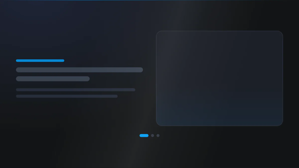
📷 Hero image
Target file: assets/img/multi-column-banner-slider/hero.webp
A split two-column hero slider captured edge to edge. The left column holds a tag pill, a bold headline with one word highlighted in the Secondary color, a short paragraph, and two buttons; the right column shows a rounded slide image. Pagination dots sit below with the active dot in the Secondary color, over a Light or dark background. Captured at desktop width so both the split and the dots are visible.
At a glance
Hero Slider Two-column
- What it does: renders a split hero with a left content column and a right media column, both driven by one slide repeater and kept in lock-step by two linked carousels. The two columns sit side by side, with a configurable width split and a breakpoint at which they stack.
- Best used for: an auto-advancing story slider, a launch hero where each slide pairs a headline with its own image or video, or a feature hero that rotates through messages.
- Not the right fit if: you only need one static split (use Multi Column Banner - Simple), a single centered hero (use Single Column Banner - Simple), or a rotating hero without a paired media column (use Single Column Banner - Slider).
- 🔗 Live demo: (add demo link)
Add it to your page
- In the HubSpot page editor, click Add and search for Multi Column Banner - Slider.
- Drag it to the top of your page.
- Open Click to update content › Slider and add your first slide (title, description, buttons).
- In each slide, open Second column and set Second column display type to
imageorvideo. - Turn on the shared content toggles you want (Show tag, Show caption title, Show description, Show button, Add video button, Show features list). These apply to every slide.
- On the Style tab, set Slider settings (dots / arrows) and Advanced settings (loop / slide / fade, and autoplay).
Design recipes
Each recipe is a look plus the exact fields to reproduce it.
Two equal columns, content left and media right.
📷 Result
Target file: recipe-simple-split-default.webp
The slider in Simple view - two equal columns with content on the left and media on the right - and pagination dots below, the active dot in the Secondary color. Capture the full width at desktop.
| Field | Set to |
|---|---|
| Slider settings › Slider navigation | dots |
| Advanced settings › Type of slider | loop |
Slides crossfade instead of sliding sideways.
📷 Result
Target file: recipe-fade-hero.webp
A hero slide mid crossfade, one message dissolving into the next with the media column changing at the same time. Capture at desktop width.
| Field | Set to |
|---|---|
| Advanced settings › Type of slider | fade |
| Advanced settings › Slider functionality | autoplay |
| Slider settings › Slider navigation | dots |
Slides advance on a timer with pagination dots.
📷 Result
Target file: recipe-autoplay-story-slider.webp
The split hero with pagination dots below, the active dot in the Secondary color. Capture a clean frame at desktop width - a mid-transition frame is fine if it reads well.
| Field | Set to |
|---|---|
| Advanced settings › Slider functionality | autoplay |
| Advanced settings › Autoplay interval time | 4000 (ms) |
| Advanced settings › Pause on hover | on |
| Slider settings › Slider navigation | dots |
Media stacks above the content on small screens.
📷 Result
Target file: recipe-image-first-on-mobile.webp
A narrow mobile-width frame showing the slide image on top at a 16/9 ratio with the content stacked below it. Capture at mobile width so the image-first stacking is clear.
| Field | Set to |
|---|---|
| View settings › In Mobile = Image - Content | on |
| View settings › Aspect ratio [mobile] | 16/9 |
| View settings › Responsive breakpoint for stacking | mini_tablet |
"I want to..." quick reference
| Goal | Setting |
|---|---|
| Change the column split | Layout settings › Width |
| Change when columns stack | Layout settings › Responsive breakpoint for stacking |
| Image on top on mobile | Layout settings › Image above content [mobile] |
| Crossfade between slides | Advanced settings › Type of slider = fade |
| Auto-advancing slides | Advanced settings › Slider functionality = autoplay |
| Dots / arrows / both | Slider settings › Slider navigation |
| Continuous loop vs stop at end | Advanced settings › Type of slider (loop / slide / fade) |
| Highlight one word in the title | Title › Highlight style + wrap the word in <span> |
| Outlined or image-filled headline | Title › Text style = stroke / image_text |
| Add a checklist under the headline | Content › Show features list |
| Add a video button to slides | Content › Add video button, then set the source per slide |
| Give one feature its own icon | Slider › (slide) › Features list › Use custom icon |
| Pause on hover | Advanced settings › Pause on hover (on by default) |
| Full-screen-height hero | Layout settings › Make section in full viewport |
| Radial gradient backdrop | Section background › Type = radial gradient |
Field reference
The editor is organized into a Content tab and a Style tab. Full field lists are grouped exactly as they appear in HubSpot. (326 fields total - expand each group as needed.)
Content tab
Section background settings
| Field | Type | Options | Default |
|---|---|---|---|
| Type | choice | none / color / image / video / radial_gradient | none |
| Upload background image | image | - | - |
| Video | file | - | - |
Click to update content
Shared toggles turn each optional block on across all slides: Show tag, Show caption title, Show description, Show button, Add video button, Show features list.
Slide (repeater) - per slide:
| Field | Type | Default |
|---|---|---|
| Caption title / Tag / Title | text | - |
| Description | richtext | - |
| Buttons | repeater | - |
| Want to add a video button? | choice | none |
| Second column › Second column display type | choice (image / video) | image |
| Features list | repeater (per slide) | - |
Buttons (per button): Type (link / cta / drag_to_section), Style (btn-1 to btn-8), Title, optional Icon.
Developer use only
Add custom css here: per-module CSS injection field.
Style tab
Color scheme
| Field | Options | Default |
|---|---|---|
| Color scheme | light / dark | light |
Drives the section's surface and text tokens. Set the background Type to none (shown as "Default (scheme)") to let the scheme supply the background colour.
Section background settings
- Color: Primary, Secondary, Tertiary, Light, Dark, White, Black, White transparent, or a custom color or custom gradient (default Default (scheme), so the section's own scheme surface shows through).
- Image / Video: overlay (none / solid / gradient, plus a custom overlay color or gradient) and focal position.
- Radial gradient: direction plus a fade color and a background color.
- Blur: toggle + amount. Parallax: toggle + scale + speed.
- Radial glow (x2): two soft glows, each with a color (default Secondary / Tertiary), one of 9 positions, size, and opacity.
- Background pattern: toggle Add pattern, then choose a style (Grid, Dots, Diagonal lines, Diagonal cross, Circuit board), its colour and opacity, a tile size, and a fade (none / top / bottom / left / right / edges) with a fade amount. Hidden when Type is Image or Video, because a pattern needs a flat surface to read against.
Section divider settings
Divider type: none / shape / border / shadow.
- Border divider: from top/bottom/both, width, color (default Tertiary).
- Shadow divider: regular / light / dark / custom shadow with x/y/blur/spread/color.
- Shape divider: 25 shapes, top/bottom/both, flip/invert, color or gradient, responsive heights.
Section spacing settings
| Field | Options | Default |
|---|---|---|
| Top | top-y-0 to top-4xl, or custom | top-xl |
| Custom top [desktop / tablet / mobile] | number | 80 / 60 / 40 |
| Bottom | bottom-y-0 to bottom-4xl, or custom | bottom-xl |
| Custom bottom [desktop / tablet / mobile] | number | 80 / 60 / 40 |
| Left | left-x-0 / left-m / left-l / left-xl | left-m |
| Right | right-x-0 / right-m / right-l / right-xl | right-m |
Choosing custom on Top or Bottom reveals the three per breakpoint number fields.
Layout settings
- Width and Gap between column: the two column split and its spacing.
- Section wrapper container and Inner content container: width control (default / full-width / 8 presets 384px to 1152px / custom per breakpoint) plus alignment.
- Maximum content width for element: per element width caps.
- Make section in full viewport: fills the screen height.
- Enable min height / Min height: an alternative fixed minimum, ignored when full viewport is on.
- Vertical content alignment: where content sits when full viewport or min height is active.
- Responsive breakpoint for stacking: the width at which the two columns stack.
- In mobile image content: controls the stacked order on small screens.
Alignment lives in its own top level Alignment group, not here. There are no Stats or Trusted logos layout settings in this module.
Responsive settings (in Layout settings)
| Field | Options | Default |
|---|---|---|
| Responsive breakpoint for stacking | mini_tablet / max_tablet | mini_tablet |
| In mobile image content | boolean | off |
There is no View type field on this module, and no per breakpoint image ratio.
Custom mobile heights are set across three width bands (below 520px, 521 to 640px, above 640px).
Preset Settings (key groups)
Eight groups, each with its own typography (including letter spacing on the Tag), colour, and spacing fields: Tag, Caption title, Title, Description, Features, Button, Video button, and Second column.
- Title: show as
h1-h6orcustom_font_size(defaulth1, custom sizes 105 / 70 / 55), colour / gradient, optional line height, highlight style, and text style (none/stroke/image_text). - Second column: styling for the per slide image or video panel.
This module has no Stats, Trusted logos, or Social proof groups and no Overlap view or outer box - those belong to Multi Column Banner - Simple.
Slider settings
- Slider navigation:
none/dots/arrows/both(defaultnone). - Slider arrows: custom left/right icons, background, icon color, border, round corner, icon size, and padding.
- Slider dots: size, round corner, spacing, border, and separate simple / active state colors.
- Advanced settings: Type of slider (
loop/slide/fade), Slider functionality (simple/autoplay), autoplay interval, and pause on hover (default on). There is no transition speed field.
Tips & gotchas
The two columns are one repeater
Content and media share a single Slider repeater, so each slide's message and its media always advance together. Add a slide once and fill both sides.
Turn navigation on
Slider navigation defaults to none, so no dots or arrows show until you pick dots, arrows, or both.
Frequently asked questions
Can a slide skip the media column entirely?
No. Second column display type only offers Image or Video, so every slide always shows some media next to its content.
Can I embed a HubSpot-hosted video in a slide?
Not directly. When Second column display type is Video, Video source offers YouTube, Vimeo, or Uploaded video (an MP4 from your file manager), not a HubSpot video player.
Which video source lets me autoplay, mute, and loop the clip?
Only Uploaded video. YouTube and Vimeo just embed the provider's own player, which doesn't give you those controls.
Is there a limit on the feature list items per slide?
Yes, 0 to 8 per slide, defaulting to 3. Slides themselves and the per-slide button list have no set limit.
What's the difference between Loop, Slide, and Fade?
Loop repeats continuously, Slide stops once it reaches the last slide, and Fade crossfades between slides. Fade can't loop the same way, so Show slides on loop rewinds it back to the first slide instead when it reaches the end.
Related modules
- Multi Column Banner - Simple: the same split layout without the carousel, for one static message.
- Single Column Banner - Slider: a rotating hero without a paired media column.
- Banner with Form: a hero built around a lead-capture form.