Megamenu
A multi-level navigation menu builder: top-level links that open either a single-column dropdown or a multi-column mega panel with link groups, featured content, and a footer bar. Best for: header navigation and product/solution panels with grouped links, icons, badges, and a promo/CTA area.
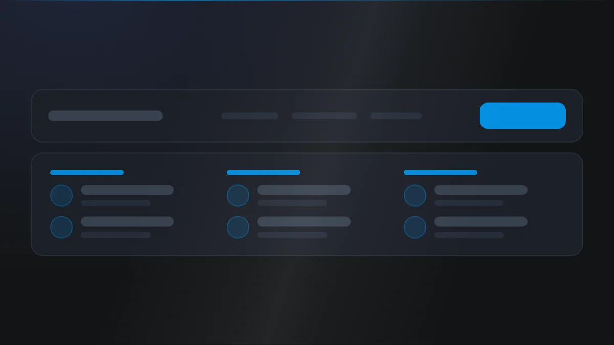
📷 Hero image
Target file: assets/img/megamenu/hero.webp
A header nav row at desktop width with one top-level item opened into a full multi-column mega panel. Show titled link columns with a small leading icon, title, and short description per link, a New badge on one entry, a featured promo block with an image and CTA on the right, and a footer bar with a CTA along the bottom. Light panel background with Dark text and Primary-colored icons and CTA. Captured at desktop width.
At a glance
Header Megamenu Dropdown
- What it does: renders a navigation list from a repeater of menu links. Each top-level item can be a plain link, a single-column dropdown, or a full multi-column mega panel with titled link columns, per-link icons, descriptions, badges, an optional featured promo area, and an optional footer bar.
- Best used for: a rich header menu where you hand-build grouped links and want promo blocks and CTAs inside the panels.
- Not the right fit if: you just want to output a plain HubSpot menu (use Simple Navigation).
- 🔗 Live demo: (add demo link)
Add it to your page
- Add or select the Megamenu module in your header.
- Under Menu link, add your top-level items and give each a Title.
- For each item, set the Submenu layout:
none(plain link),single(dropdown), ormulti(mega panel). - For multi-column panels, choose a Megamenu layout of
links_onlyorlinks_with_featured. - Add Columns, each with a Column title and Column links (icon, description, badge).
- Tune columns, gaps, and ratios on the Style tab.
Design recipes
Each recipe is a look plus the exact fields to reproduce it.
A classic simple dropdown of sub-links.
📷 Result
Target file: recipe-single-column-dropdown.webp
One top-level item open into a single narrow dropdown of stacked sub-links, no icons or columns. Dark links on a Light panel, hovered link in the Primary color.
| Field | Set to |
|---|---|
| Menu link › Submenu layout | single |
| Single column › Title / Link | your sub-links |
Grouped link columns with no promo area.
📷 Result
Target file: recipe-multi-column-links-only.webp
An open mega panel with four titled link columns and no featured block, each link showing a leading icon and short description. Light panel with Dark text and Primary-colored icons.
| Field | Set to |
|---|---|
| Menu link › Submenu layout | multi |
| Multi column › Megamenu layout | links_only |
| Style 1 › Links only › No. of columns for link group | 4 |
Link columns beside a featured image, heading, and CTA.
📷 Result
Target file: recipe-links-with-featured.webp
An open mega panel split roughly 7fr to 3fr: titled link columns on the left and a featured promo block on the right with an image, heading, short copy, and a Primary CTA button.
| Field | Set to |
|---|---|
| Multi column › Megamenu layout | links_with_featured |
| Multi column › Featured image | your promo content |
| Multi column › Add link for featured content | on + CTA text/link |
| Style 1 › Width ratio of link group & featured image | 7fr 3fr |
Links with icons and New/Beta badges, plus a bottom CTA bar.
📷 Result
Target file: recipe-icons-badges-footer-bar.webp
An open mega panel where several links carry leading icons and small New or Beta badges, with a footer bar CTA strip running across the bottom of the panel. Badges and CTA in the Primary color.
| Field | Set to |
|---|---|
| Column links › Icon choose from | hubspot_library, upload_image or add_svg_code |
| Column links › Show badge + Badge text | on / New |
| Multi column › Show footer bar | on + text/CTA |
"I want to..." quick reference
| Goal | Setting |
|---|---|
| Plain header link, no dropdown | Menu link › Submenu layout = none |
| Simple dropdown list | Submenu layout = single |
| Full mega panel | Submenu layout = multi |
| Add a promo box in the panel | Multi column › Megamenu layout = links_with_featured |
| Make the top item clickable too | Menu link › Has link + Link |
| Add an icon to a mega link | Column links › Icon choose from = hubspot_library, upload_image or add_svg_code |
| Tag a link as new | Column links › Show badge + Badge text |
| Add a bottom CTA bar | Multi column › Show footer bar + text/CTA |
| Add a CTA to the featured area | Multi column › Add link for featured content + text/link |
| Change link columns per panel | Style 1 › No. of columns for link group |
| Adjust link vs featured width split | Style 1 › Width ratio of link group & featured image |
| Space out title from description | Style 1 › Spacing › Spacing between title and description |
Field reference
The editor is organized into a Content tab and a Style tab, grouped exactly as they appear in HubSpot. (308 fields total - expand each group as needed.)
Content tab
Menu link
| Field | Type | Options | Default |
|---|---|---|---|
| Title | text | - | - |
| Has link / Link | boolean / link | - | off |
| Submenu layout | choice | none / single / multi | none |
Single column is a repeater of sub-links (title + optional link). Multi column unlocks the mega panel below.
Multi column - Columns
Each column has a Column title and a repeater of Column links:
| Field | Type | Default |
|---|---|---|
| Title / Description | text / richtext | - |
| Has link / Link | boolean / link | off |
| Icon choose from | choice (no_icon / hubspot_library / upload_image / add_svg_code) | hubspot_library |
| SVG code | text (shown when Icon choose from is add_svg_code) | - |
| Icon / Icon image | icon / image | Circle |
| Show badge / Badge text | boolean / text | off |
Multi column - Featured + footer bar
- Featured: image, heading, description, plus Add link for featured content to reveal CTA text + link (styled from theme settings).
- Footer bar: Show footer bar to reveal footer text, CTA label, and CTA link (shows as a button only when a link is set).
Style tab
Style 1 - Links only
| Field | Type | Default |
|---|---|---|
| No. of columns for link group | number | 4 |
| Gap between link group | number | 18 |
Style 1 - Links with featured
| Field | Type | Options | Default |
|---|---|---|---|
| Width ratio of link group & featured image | choice | 3fr 2fr / 7fr 3fr / 1fr 1fr / 4fr 1fr | 7fr 3fr |
| Gap between columns of link group & featured image | number | - | 24 |
| No. of columns for link group | number | - | 3 |
| Gap between columns [desktop] | number | - | 24 |
| Gap between columns [mobile] | number | - | 32 |
Link badge
The small New / Beta chip beside a mega-panel link. The desktop group owns the shared typography - badge font, Letter spacing, and text transform - which applies at every width. The mobile group owns only what differs on small screens: font size, padding, and gap.
| Field | Type | Default |
|---|---|---|
| Make a tag | boolean | on |
| Letter spacing | number (px) | 0 |
| Background | choice (none / default) | default |
| Vertical / Horizontal spacing | number (px) | padding inside the chip |
| Round corner | choice (round-0 to round-xxl / custom) | - |
| Show border / Border width | boolean / number | off |
| Gap between text and badge | choice (gap-0 to gap-4xl) | - |
Turn Make a tag off to render the badge as plain text beside the link.
Style 1 - Spacing
| Field | Type | Default |
|---|---|---|
| Spacing between title and description | number | 3 |
Tips & gotchas
Choose the panel per item
The Submenu layout on each menu link decides everything downstream: none keeps it a plain link, single gives a dropdown, and multi unlocks the full mega panel with columns and featured content.
Footer CTA needs a link
The footer bar CTA renders as a button only when a Footer bar link is set. With text but no link it will not appear as a clickable button.
Theme-driven CTA styling
Button and icon styling for the featured CTA and footer bar, plus icon vertical alignment, come from your theme header megamenu settings, not from this module.
Logo, language switcher and search
Megamenu carries the same logo, language switcher and search field groups as Simple Navigation, with identical options. They are documented once, on the Simple Navigation page, so the two never drift apart:
Related modules
- Simple Navigation: output a plain HubSpot menu.
- Logo: the logo beside your menu.
- Buttons: standalone CTA buttons for elsewhere on the page.