Content and Media
A two-column "text beside media" section: a content column (icon, subtitle, title, caption, description, buttons) next to a media column of images or a poster-driven lightbox video. Best for: feature explainers, alternating content / image rows, product highlights, "how it works" sections, video showcases.
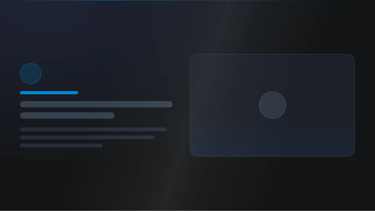
📷 Hero image
Target file: assets/img/content-and-media/hero.webp
A two-column "text beside media" section on a Light background. The left column holds a subtitle pill, a bold title with one word highlighted in the Secondary color, a short paragraph, and a Primary button; the right column shows a rounded image. Split the columns evenly. Captured at desktop width so the side-by-side layout is clear.
At a glance
Text + media Two columns Lightbox video
- What it does: renders a responsive two-column grid with a content column beside a media column. The content side holds an icon, subtitle, highlightable title, caption, description, and buttons. The media side repeats images (auto-arranging into a 1 / 2 / 3 / 4 grid) or a poster image that opens a lightbox video.
- Best used for: an alternating feature row, a product highlight beside its screenshot, a "how it works" step with an image, or a video showcase with a play button.
- Not the right fit if: you need a repeating grid of cards (use Content Card), or a plain image gallery (use Image Box).
- 🔗 Live demo: (add demo link)
Add it to your page
- In the HubSpot page editor, click Add and search for Content and Media.
- Drag it onto your page.
- Open Click to update content and fill in the Tag, Title, Caption title, and Description.
- Add items to the Media repeater: pick Type of media (image or video) and upload the image or set the video type, ID, and poster.
- Turn on Add button to add a CTA row.
- Use Layout to set the width ratio, flip the columns, and align the content.
Design recipes
Each recipe is a look plus the exact fields to reproduce it.
The default arrangement, split evenly.
📷 Result
Target file: recipe-content-left-media-right.webp
The section with left-aligned copy on the left and a rounded image on the right, split into two even columns. Capture the full width at desktop.
| Field | Set to |
|---|---|
| Layout › Width › Arrangement | content_media |
| Layout › Width › Content x media | 1fr 1fr |
| Layout › Content alignment | left |
Image leads on desktop.
📷 Result
Target file: recipe-media-first.webp
The same section reversed - a wide image on the left and a narrower content column on the right. Capture at desktop width so the media-first arrangement reads clearly.
| Field | Set to |
|---|---|
| Layout › Width › Arrangement | media_content |
| Layout › Width › Content x media | 3fr 7fr |
Poster image with a lightbox play button and pulse ring.
📷 Result
Target file: recipe-video-showcase.webp
The media column showing a poster image with a circular play button in the center and a pulsing ring around it. Capture at desktop width so the play affordance is clearly visible.
| Field | Set to |
|---|---|
| Media item › Type of media | video |
| Media item › Video type | youtube / vimeo / hubspot |
| Media item › Video poster image | your poster |
| Video icon › Activate pulse effect | on |
Two to four images auto-arranging in the media grid.
📷 Result
Target file: recipe-multi-image-collage.webp
The media column holding two to four images auto-arranged into a tidy collage grid beside the content. Capture at desktop width so the multi-image arrangement is clear.
| Field | Set to |
|---|---|
| Content › Media | add 2 to 4 image items |
| Media › Ratio for media | aspect-16by9 (or keep none) |
"I want to..." quick reference
| Goal | Setting |
|---|---|
| Put the image on the left | Layout › Width › Arrangement = media_first |
| Make the text column wider | Layout › Width › Content x media = 7fr 3fr |
| Stack columns sooner on tablet | Layout › Width › Responsive breakpoint for stacking = tablet_max |
| Center the text | Layout › Content alignment = center |
| Two / three / four images side by side | Add 2 / 3 / 4 items to Content › Media (auto-grids) |
| Embed a YouTube / Vimeo video | Media item › Type of media = video + type + ID + poster |
| Add a pulsing ring to the play button | Video icon › Activate pulse effect |
| Highlight one word in the title | Wrap it in <span> + Title › Highlight style |
| Turn the subtitle into a pill | Subtitle › Background + round corner |
| Crop all media to 16:9 | Media › Ratio for media = aspect-16by9 |
| Different corner radius per image | Media › Apply a specific border radius to multiple images |
| Full-width buttons on mobile | Button › Buttons › Make button full width [mobile] |
| Add a parallax effect to the image | Media › Add parallax effect (+ speed / scale) |
Field reference
The editor has a Content tab and a Style tab, grouped exactly as they appear in HubSpot. (251 fields total - expand each group as needed.)
Content tab
Click to update content
| Field | Type | Default |
|---|---|---|
| Icon above subtitle | choice (no_icon / hubspot / upload / svg) | no_icon |
| Show tag / Tag | boolean / text | on / New |
| Title | text | Build something great with confidence |
| Show caption title / Caption title | boolean / text | on |
| Description | richtext | short default paragraph |
| Add button | boolean | off |
Button (repeater): Type (link / cta / drag_to_section), Style (btn-1 to btn-8), Link / CTA / Section name, Title, optional Icon. Media (repeater): Type of media (image / video), Image, Video type (youtube / vimeo / hubspot) + ID / file, Video poster image (required for video to show).
Drag to section name
Section name: sets this section's ID for scroll-to-section links.
Style tab
Color scheme
| Field | Options | Default |
|---|---|---|
| Color scheme | light / dark | light |
Drives the section's surface and text tokens. Set the background Type to none (shown as "Default (scheme)") to let the scheme supply the background colour.
Section background settings
Color / gradient / image / video (overlay + position), blur, parallax, and dual radial glows (color, position, size, opacity).
Section divider settings
Divider type: none / shape / border / shadow, with border, shadow, and 25-shape options (flip / invert, color / gradient, responsive heights).
Section spacing settings
| Field | Options | Default |
|---|---|---|
| Top | top-y-0 to top-4xl | top-xl |
| Bottom | bottom-y-0 to bottom-4xl | bottom-xl |
| Left | left-x-0 to left-xl | left-m |
| Right | right-x-0 to right-xl | right-m |
Top and Bottom also accept custom, which reveals Custom top / Custom bottom number fields for desktop, tablet, and mobile (defaults 80 / 60 / 40).
Layout settings
- Width: Content x Media ratio (
1fr 1fr/2fr 3fr/3fr 2fr/3fr 7fr/7fr 3fr), stacking breakpoint (tablet_mini/tablet_max), and Arrangement (content first or media first). - Vertical alignment: center / start / end.
- Gap between column: per-breakpoint gap.
- Content alignment: left / center / right for the text.
- Section wrapper container and Inner content container: width + alignment.
Preset Settings - Title (key fields)
| Field | Type | Default |
|---|---|---|
| Show title as | choice (custom / h1-h6) | h2 |
| Font size [desktop / tablet / mobile] | number | 72 / 52 / 36 |
| Color | choice (tokens / custom / gradient) | default |
| Spacing under element | Default / 0 / S / M / L / XL / 2XL / 3XL / 4XL | Default |
| Highlight style | none / underline / custom color / gradient / different font | none |
| Text style | none / stroke / image_text | none |
Other element groups: Top icon (chip background, blur, border, round corner), Tag (pill background, padding, round corner, bold), Caption title (tag, color, transform), Description (typo, color), Button (any button set to the Simple Link style switches to its own color, underline, bold and icon controls; the other seven skins share a size, an icon-text gap and full-width-on-mobile).
Preset Settings - Media & Video icon
- Media: aspect ratio (9 ratios or none), shadow, image gap (desktop / mobile), parallax, border, focal position, shared or per-image (first to fourth) corner radii.
- Video icon: background (color / gradient / glass blur), icon color, size, round corner, border, hover scale, and an optional pulse ring (width, color, maximum scale).
Developer use only
Add custom css here: per-module CSS injection field.
Tips & gotchas
A video item needs a poster
A media item set to video only renders once a Video poster image is set. The poster is what shows before the lightbox opens, so use a clear, high-quality frame.
Ratio crops your media
Setting Ratio for media forces every image to that aspect ratio. If parts of an image get cut off, adjust Image object position to keep the important area in view, or set the ratio back to none.
Per-image corners need the toggle
The first-to-fourth image radius fields only apply after you turn on Apply a specific border radius to multiple images. Otherwise all images share the single Round corner value.
Frequently asked questions
How many images or videos can I add, and how does the grid arrange them?
Up to 4 items in Content › Media. The grid arranges itself by count: 1 item fills the column, 2 or 4 items sit in a 2-column grid, and 3 items sit in a 3-column grid. You can't pick a different arrangement manually, and there's no manual masonry or custom-position option.
Can I mix images and videos in the same Media list?
Yes. Each item has its own Type of media switch (image / video), so one item can be a plain image and the next a YouTube, Vimeo, or HubSpot video with its own poster.
Can the media block appear above the content on mobile, even if the desktop arrangement is content-first?
Yes. Layout › Width › Make media on top [mobile] forces the media block above the content once the columns stack, no matter which Arrangement you picked for desktop.
What controls when the two columns stack into one on tablet?
Layout › Width › Responsive breakpoint for stacking (tablet_mini at 767px or tablet_max at 1023px). This same setting also decides the breakpoint Make media on top [mobile] uses to flip the stacking order back to normal, so the two fields move together.
Can the feature list run in two columns?
Yes. Preset Settings › Feature list has Feature list columns for desktop and a separate Feature list columns [mobile], each a choice of 1 or 2 columns, so you can run 2 columns on desktop and 1 on mobile or any other combination.
Can I combine the stroke title style with a highlighted word?
No. Title › Text style → stroke only renders when Highlight style is set to "I don't want to highlight any word." Pick any other highlight style (underline, custom color, gradient, different font) and the stroke effect on the rest of the title is skipped.
Related modules
- Content: the content column on its own, in one or two columns.
- Content Card: when the content should repeat as a grid or slider of cards.
- Image Box: a dedicated image gallery with captions and lightbox zoom.
- Video Embed: a standalone video block without the side-by-side text.