Contact Card
A responsive grid of contact cards: each with an icon, optional tag pill, title, description, and a smart link (email / phone / external). Best for: "get in touch" / contact-method grids, support-channel blocks, "ways to reach us" sections, office/department contact lists.
📷 Hero image
Target file: assets/img/contact-card/hero.webp
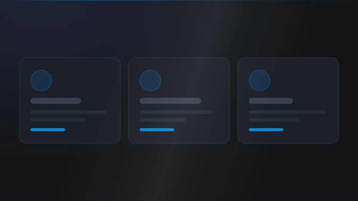
A three-column grid of contact cards on a Light background, each card showing a circular icon badge in the Primary color, a title such as "Email us" or "Call us", a short description, and a smart link with a trailing arrow. Keep the cards evenly sized with comfortable padding and soft rounded corners. Captured at desktop width.
At a glance
Contact Cards Smart links
- What it does: renders a column-based grid of contact cards. Each card shows an icon, an optional tag pill, a title, a rich-text description, and an optional smart link that turns email URLs into
mailto:and phone URLs intotel:. - Best used for: a "ways to reach us" grid, support-channel tiles, or an office/department contact list.
- Not the right fit if: you need people profiles with photos and roles (use Team) or an actual form to fill in (use Form).
- 🔗 Live demo: (add demo link)
Add it to your page
- In the HubSpot page editor, click Add and search for Contact Card.
- Drag it where you want the contact grid.
- Open Click to update content › Contact cards and add your first card.
- Pick a Icon type source (HubSpot library, uploaded image, or pasted SVG), then set the Title and Description.
- Turn on Add link, set an Email / Phone / external URL, and write the Link title.
- Set the grid under Layout settings › Columns and, for a card look, Card › Make a card.
Design recipes
Each recipe is a look plus the exact fields to reproduce it.
Icon, title, and description with no card box.
📷 Result
Target file: recipe-simple-grid-default.webp
Three left-aligned contact tiles with an icon, title, and description each, with no card box or border, on a Light background.
| Field | Set to |
|---|---|
| Card › Make a card | off |
| Layout settings › Columns › Desktop | 3 |
| Card › Alignment › Content alignment | left |
Bordered, shadowed, padded card boxes.
📷 Result
Target file: recipe-card-style.webp
Each contact tile wrapped in a bordered, padded, rounded card with a light shadow, arranged in a tidy row on a Light background.
| Field | Set to |
|---|---|
| Card › Make a card | on |
| Card › Border › Show border | on |
| Card › Shadow › Card shadow | light-shadow |
| Card › Round corner › Card round corner | round-m |
A large circular icon badge above each title.
📷 Result
Target file: recipe-icon-led-tiles.webp
Each tile topped by a large circular icon badge in the Light color, with the title and description stacked below it. Show the badge-title-description stack repeating across the grid.
| Field | Set to |
|---|---|
| Preset Settings › Icon › Icon background | bg-light |
| Preset Settings › Icon › Roundness of background | round-100 |
| Preset Settings › Icon › Spacing around icon | e.g. 16 |
Click-to-email / click-to-call links with an arrow.
📷 Result
Target file: recipe-linked-contact-cards.webp
Contact cards each ending in an underlined link such as "Email us" with a small trailing arrow icon, hinting at click-to-email and click-to-call actions.
| Field | Set to |
|---|---|
| Contact cards › Add link | on (Email or Phone URL) |
| Contact cards › Link title | e.g. "Email us" |
| Preset Settings › Link › Add icon | on |
| Preset Settings › Link › Add underline | on |
"I want to..." quick reference
| Goal | Setting |
|---|---|
| Hide the icon on a card | Contact cards › Icon type = no_icon |
| Use a custom brand icon | Icon type = add_svg_code (or Upload icon) |
| Circular icon badge | Icon › Icon background + Roundness of background = round-100 |
| Add a pill label | Contact cards › Tag + Style › Tag › Tag background |
| Make the tag plain text (no pill) | Tag › Tag background = None |
| Click-to-email / click-to-call | Add link with an Email / Phone URL (auto mailto: / tel:) |
| Show only an icon link (no text) | Leave Link title empty |
| Add an arrow next to the link | Link › Add icon |
| Underline the link | Link › Add underline (+ offset) |
| Cards with shadow | Card › Make a card + Shadow |
| Glass / frosted card | Card › Background › Make a background blur (over an image) |
| 3-up desktop / 2-up tablet / 1-up mobile | Layout › Columns = 3 / 2 / 1 |
| Left- or center-align card content | Card › Alignment › Content alignment |
Field reference
The editor is organized into a Content tab and a Style tab. Full field lists are grouped exactly as they appear in HubSpot. (187 fields total - expand each group as needed.)
Content tab
Contact cards (repeater)
| Field | Type | Default |
|---|---|---|
| Icon type | choice (no icon / HubSpot library / upload / SVG) | no_icon |
| Library icon / Upload icon / Svg code | icon / image / text | - |
| Tag | text | - (optional pill above the title) |
| Title | text | Title |
| Description | richtext | - |
| Add link / Link / Link title | boolean / link / text | off |
The link is smart: Email URLs resolve to mailto:, Phone URLs to tel:. Leave Link title empty to show only the link icon.
Section background settings + Drag to section name + Developer
- Section background:
none/color/image/video(Style tab adds overlay, position, blur, parallax, and dual radial glows). - Drag to section name: custom section ID for scroll-to-section links.
- Developer use only: per-module custom CSS field.
Style tab
Color scheme
| Field | Options | Default |
|---|---|---|
| Color scheme | light / dark | light |
Drives the section's surface and text tokens. Set the background Type to none (shown as "Default (scheme)") to let the scheme supply the background colour.
Section divider settings
Divider type: none / shape / border / shadow.
- Border divider: from top/bottom/both, width, color (default Tertiary).
- Shadow divider: regular/light/dark/custom shadow with x/y/blur/spread/color.
- Shape divider: 25 shapes, top/bottom/both, flip/invert, color or gradient, responsive heights.
Section spacing settings
| Field | Options | Default |
|---|---|---|
| Top | top-y-0 to top-4xl | top-xl |
| Bottom | bottom-y-0 to bottom-4xl | bottom-xl |
| Left | left-x-0 / left-m / left-l / left-xl | left-m |
| Right | right-x-0 / right-m / right-l / right-xl | right-m |
Top and Bottom also accept custom, which reveals Custom top / Custom bottom number fields for desktop, tablet, and mobile (defaults 80 / 60 / 40).
Layout settings
- Columns: per breakpoint (default 3 / 2 / 1).
- Gap between column: per breakpoint (default 24 each).
- Section wrapper container and Inner content container: independent width caps + block alignment.
Card
Optional wrapper (off by default). Make a card enables:
- Alignment › Content alignment: left / right / center.
- Background: token / gradient / custom color / custom gradient, plus Make a background blur (glass) with a blur radius.
- Border: width, style (solid/dashed/dotted/double), token/custom color.
- Card padding: responsive (desktop / tablet / mobile).
- Shadow: none / light / regular / dark.
- Round corner:
round-0toround-xxl(defaultround-s). - Make card same height: on by default. Cards in a row stretch to the tallest one and the link pins to the bottom, so links line up across the row.
Preset Settings
Per-element groups:
- Icon: size (desktop/mobile), color, padding around icon, Icon background shape (with blur, round corner including circle), and spacing.
- Tag: background (turns it into a pill), text color, padding, border, round corner, font size, bold, transform, spacing.
- Title: heading tag h1-h6 or custom per-screen size, color, spacing, bold, transform, letter spacing.
- Description: typo style, color, spacing.
- Link: color and hover color (each Default, following the scheme, or Custom), font family, bold, optional trailing icon (size + gap), optional underline (with offset), spacing.
Tips & gotchas
Icon-only quick links
Leave the Link title empty to render just the link icon - handy for compact social or contact icon tiles.
Icon color only works for library and SVG icons
The Icon color field only recolors icons chosen from the HubSpot library or a stroke SVG. Uploaded image icons keep their own colors.
Tag pill vs plain text
The Tag shows as plain text until you give it a Tag background. Any value other than None turns it into a padded pill.
Equal card height is on by default
Card › Make card same height ships on, so a row of cards takes the height of the tallest and the links align along the bottom. This applies to Contact Cards that were already published, not only new ones. Turn it off for cards that should each shrink to their own content.
Frequently asked questions
Is there a limit to how many contact cards I can add?
No. Click to update content › Contact cards has no minimum or maximum, so add as many as you need.
Can the grid go wider than 3 columns on desktop?
Yes, up to 6. Layout settings › Columns › Desktop accepts 1 to 6, with separate values for tablet (default 2) and mobile (default 1).
Can a card's link point to a HubSpot CTA, a file, a blog, or a payment link instead of a plain URL?
Yes. Button is a native HubSpot link field that supports External URL, Page/Content, File, Email address, Blog, Call-to-action, Phone number, and Payment link, not just a plain URL.
Can different cards use different icon sources?
Yes. Icon type (no icon / HubSpot library / upload / SVG) is set per card inside the repeater, so one card can use a library icon while another uses a pasted SVG.
Are Show tag / Show title / Show description / Show icon / Show button switches per card, or for the whole grid?
For the whole grid. Those toggles live in Click to update content, above the Contact cards repeater, so turning one off hides that element on every card at once, not just one.
Can a card's link open in a new tab?
Yes. The Button link field includes an "open in new tab" option, off by default.
Related modules
- Team: for people profiles with photos and roles instead of contact methods.
- Form: when visitors should submit details rather than reach out directly.
- Call to Action: a CTA band to pair above a contact grid.