Call to Action
A two-column CTA band: a left text column (subtitle, title, caption, description, buttons) paired with a right column that can be a button group, social icons, a single image, or nothing. Best for: closing CTAs, newsletter / contact prompts, "ready to start?" bands, split image-plus-copy promos, footer call-outs.
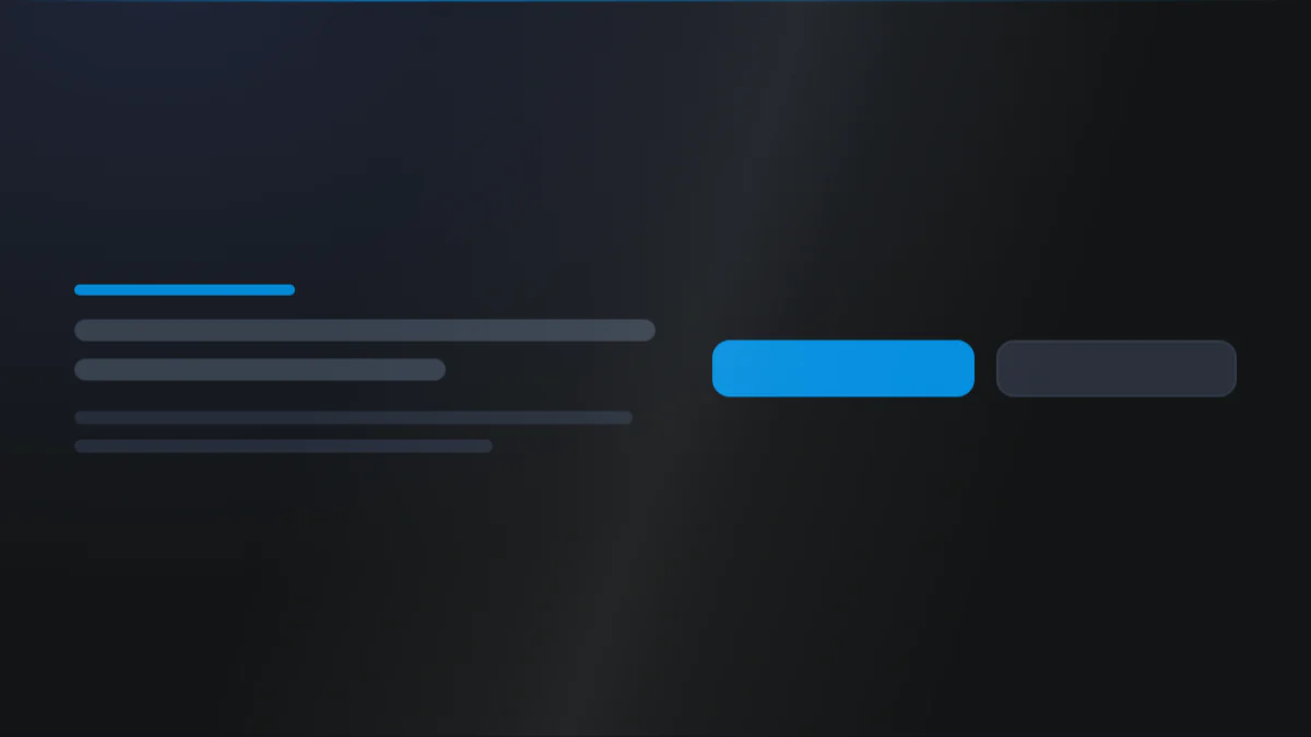
📷 Hero image
Target file: assets/img/call-to-action/hero.webp
A two-column call-to-action band on a Dark background: a left text column with a small pill subtitle in the Secondary color, a bold "ready to get started?" title, a short supporting line, and a right column holding a group of buttons. Include one solid Primary button and one lighter secondary button, vertically centered against the left copy. Keep the split balanced and roomy. Captured at desktop width.
At a glance
CTA Conversion Two-column
- What it does: renders a responsive two-column band. The left column always holds the messaging (optional pill subtitle, title, caption, description, buttons); the right column is switchable between a second button group, a row of social icons, a single image, or nothing for a single-column CTA.
- Best used for: a closing "ready to get started?" band, a newsletter or contact prompt, or a split image-plus-copy promo.
- Not the right fit if: you only need a standalone row of buttons with no headline column (use Buttons) or you want an embedded lead-capture form (use Form).
- 🔗 Live demo: (add demo link)
Add it to your page
- In the HubSpot page editor, click Add and search for Call to Action.
- Drag it where you want the CTA (these usually sit near the end of a page).
- Open Click to update content › Left column and fill in the Tag, Title, Caption title, and Description.
- Turn on Add button and add your left-column buttons.
- Open Right column › What you want to see? and pick a button group, social icons, a single image, or nothing.
- Fine-tune the split under Layout settings › Width and, if you want a card look, Card UI.
Design recipes
Each recipe is a look plus the exact fields to reproduce it.
Left copy paired with a right button group in equal columns.
📷 Result
Target file: recipe-classic-split-cta-default.webp
An even two-column band with the headline and copy on the left and a group of buttons on the right, both vertically centered. Show a solid Primary button beside a lighter secondary button.
| Field | Set to |
|---|---|
| Right column › What you want to see? | group_of_buttons |
| Left column › Add button | on |
| Layout settings › Width › Left column x right column | 1fr 1fr |
| Vertical alignment › Alignment | items-center |
Messaging on the left, a styled row of social icons on the right.
📷 Result
Target file: recipe-copy-social-row.webp
The left copy column paired with a right column of rounded social icon badges on a Light background, each icon in the Dark color inside a circular chip.
| Field | Set to |
|---|---|
| Right column › What you want to see? | social_media_icons |
| Right column social media icons › Background color | bg-light |
| Right column social media icons › Icon color | Dark |
| Right column social media icons › Round corner | round-100 |
A single image beside the copy, cropped and rounded.
📷 Result
Target file: recipe-copy-image.webp
A wider left copy column beside a narrower right image that is cropped to a 4-by-3 ratio with softly rounded corners. Keep the copy column visibly larger than the image.
| Field | Set to |
|---|---|
| Right column › What you want to see? | single_image |
| Right column single image › Image ratio | aspect-4by3 |
| Right column single image › Round corner | round-l |
| Layout settings › Width › Left column x right column | 3fr 2fr |
The whole content wrapped in a styled box with a background and shadow.
📷 Result
Target file: recipe-boxed-cta-card.webp
The full CTA content wrapped in a single rounded box with a Dark background and a soft dark shadow, floating on the section background. Show the box edges clearly at desktop width.
| Field | Set to |
|---|---|
| Style › Card UI | on |
| Card UI settings › Background › Background | custom_color (Dark) |
| Card UI settings › Round corner › Round corner | round-l |
| Card UI settings › Shadow › Shadow | dark-shadow |
"I want to..." quick reference
| Goal | Setting |
|---|---|
| Single-column centered CTA | Right column › What you want to see? = dont_want_to_add + alignments = center |
| Buttons on both sides | Left column › Add button + Right column = group_of_buttons |
| Show social links instead of buttons | Right column › What you want to see? = social_media_icons |
| Put an image beside the copy | Right column › What you want to see? = single_image |
| Make the image clickable | Right column › Image link (set a URL) |
| Wider copy column / narrower image | Layout › Width › Left column x right column (e.g. 3fr 2fr) |
| Wrap everything in a card | Style › Card UI |
| Glass / frosted box | Card UI settings › Background › Add blur in background (with a transparent color) |
| Image background that scrolls | Card UI settings › Background › Image + Add parallax |
| Pill-style subtitle | Subtitle › Make a tag = on |
| Add a background pattern | Section background › Add pattern (+ style, colour, size, fade) |
| Highlight a word in the title | Wrap it in <span> + Title › Highlight style |
| Outlined headline | Title › Text style = stroke |
| Image-filled headline | Title › Text style = image_text + Image |
| Swap column order on desktop | Layout › Reverse columns [desktop] |
| Image above copy on mobile | Layout › Make image on the content [mobile] |
| Full-width buttons on phones | Left/Right column button › Buttons › Make button full width [mobile] |
| Stack columns later (on tablet) | Layout › Width › Responsive breakpoint for stacking = max_tablet |
Field reference
The editor is organized into a Content tab and a Style tab. Full field lists are grouped exactly as they appear in HubSpot. (272 fields total - expand each group as needed.)
Content tab
Left column
| Field | Type | Default |
|---|---|---|
| Show tag / Tag | boolean / text | on |
| Title | text | Title |
| Show caption title / Caption title | boolean / text | on |
| Show description / Description | boolean / richtext | on |
| Add button / Buttons (repeater) | boolean / group | off |
Buttons (per button): Type (link / cta / drag_to_section), Title, Style (btn-1 to btn-8, default btn-1), Link/CTA/Section name, optional Icon (before/after), and an accessibility label.
Right column
- What you want to see? picks
dont_want_to_add/group_of_buttons/single_image/social_media_icons(defaultgroup_of_buttons). - Buttons: independent repeater, same fields as the left column.
- Image + Image link: a single image with an optional clickable link wrap.
- Social media links: repeater of icon + link with a per-icon accessibility label.
Section background settings + Drag to section name + Developer
- Section background:
none/color/image/video(Style tab adds overlay, position, blur, parallax, dual radial glows, and a geometric pattern overlay). - Drag to section name: custom section ID for scroll-to-section links.
- Developer use only: per-module custom CSS field.
Style tab
Color scheme
| Field | Options | Default |
|---|---|---|
| Color scheme | light / dark | light |
Drives the section's surface and text tokens. Set the background Type to none (shown as "Default (scheme)") to let the scheme supply the background colour.
Section divider settings
Divider type: none / shape / border / shadow.
- Border divider: from top/bottom/both, width, color (default Tertiary).
- Shadow divider: regular/light/dark/custom shadow with x/y/blur/spread/color.
- Shape divider: 25 shapes, top/bottom/both, flip/invert, color or gradient, responsive heights.
Section spacing settings
| Field | Options | Default |
|---|---|---|
| Top | top-y-0 to top-4xl | top-xl |
| Bottom | bottom-y-0 to bottom-4xl | bottom-xl |
| Left | left-x-0 / left-m / left-l / left-xl | left-m |
| Right | right-x-0 / right-m / right-l / right-xl | right-m |
Top and Bottom also accept custom, which reveals Custom top / Custom bottom number fields for desktop, tablet, and mobile (defaults 80 / 60 / 40).
Layout settings
- Width: column ratio (
1fr 1fr,2fr 3fr,3fr 2fr,3fr 7fr,7fr 3fr, single) + stacking breakpoint (mini_tablet/max_tablet). - Vertical alignment:
items-center/items-start/items-end. - Reverse columns [desktop] and Make image on the content [mobile].
- Alignment: independent left/center/right per column, desktop and mobile.
- Gap between column: separate desktop / tablet / mobile values.
- Section wrapper container and Inner content container: independent width caps + block alignment.
Card UI settings
Optional card around the content, switched on by Card UI (off by default). It carries a Background (color / gradient / image with overlay, position, and parallax, plus a blur), Card padding (responsive), Border (width, style, color), Round corner (default round-l), and Shadow (none / regular / dark / light).
Preset Settings
Per-element groups, each with color, spacing, and sizing:
- Subtitle: color, spacing, bold, transform, letter spacing, and a Show tag background that turns it into a padded pill (with padding, round corner, border, font size).
- Title: heading tag
h1-h6(defaulth2), text transform, color (default/custom_color/custom_gradient), make font bold, spacing below element, Highlight style (underline / color / gradient / different font), and Text style (none/stroke/image_text). There is no per-screen font size or line height on this title. - Caption title: heading tag, color, spacing.
- Description: typo style, color, spacing.
- Left / Right column button: independently for each column, any button set to the Simple Link style (
btn-7) switches to its own color, underline + offset, bold and icon size/gap controls; the other seven skins share a size, an icon-text gap, and a full-width-on-mobile toggle. Gap between buttons (desktop/mobile) applies to both. - Right column single image: ratio, position, round corner, shadow.
- Right column social media icons: background, icon color, size (desktop/mobile), padding, round corner, border, gap, hover scale (default 1.05).
Tips & gotchas
Single-column CTA
Set Right column › What you want to see? to dont_want_to_add and set both column alignments to center for a clean, centered headline-plus-buttons band.
Box styles need the box turned on
Everything under Card UI settings (background, border, padding, shadow) only applies once Card UI is on. If your card styling seems to do nothing, check that toggle first.
Highlight a word in the title
Wrap the word in <span> inside the Title field, then pick a Highlight style. Stroke and image-text treatments are only available when no word is highlighted.
Frequently asked questions
Is there a limit to how many buttons I can add in a column?
No. Both Left column › Buttons and Right column › Buttons are unlimited repeaters, so add as many as the layout can fit.
Is there a limit to how many social icons I can add in the right column?
No. Right column › Social media links has no minimum or maximum.
Can the right column show an image and a button group at the same time?
No. Right column › What you want to see? is a single choice between a button group, a single image, social icons, or nothing, so only one shows at a time.
Can a button link to a URL, a HubSpot CTA, or scroll to a section, in the same button group?
Yes. Each button in the repeater has its own Type field (Link, CTA, or Drag to Section), set independently per button.
Can I give a button a screen-reader label that's different from its visible text?
Yes. Each button has an Accessibility label (aria-label) field, separate from the button's visible Title.
Can the tag and the caption title both show above the main title at the same time?
Yes. Show tag and Show caption title are independent toggles, so both can be on together, stacked above the title.
Related modules
- Buttons: a standalone button group with no headline column.
- Form: when the call to action should capture leads with an embedded form.
- Section Title: a simple heading block to pair above a CTA.