Buttons
A standalone button group: one or more buttons (link, scroll-to-section, or HubSpot CTA) in a configurable row, with an optional supporting heading line. Best for: call-to-action rows, "get started / book a demo" pairs, supporting microcopy under a CTA, section anchor jumps, and reusable button blocks dropped anywhere on a page.
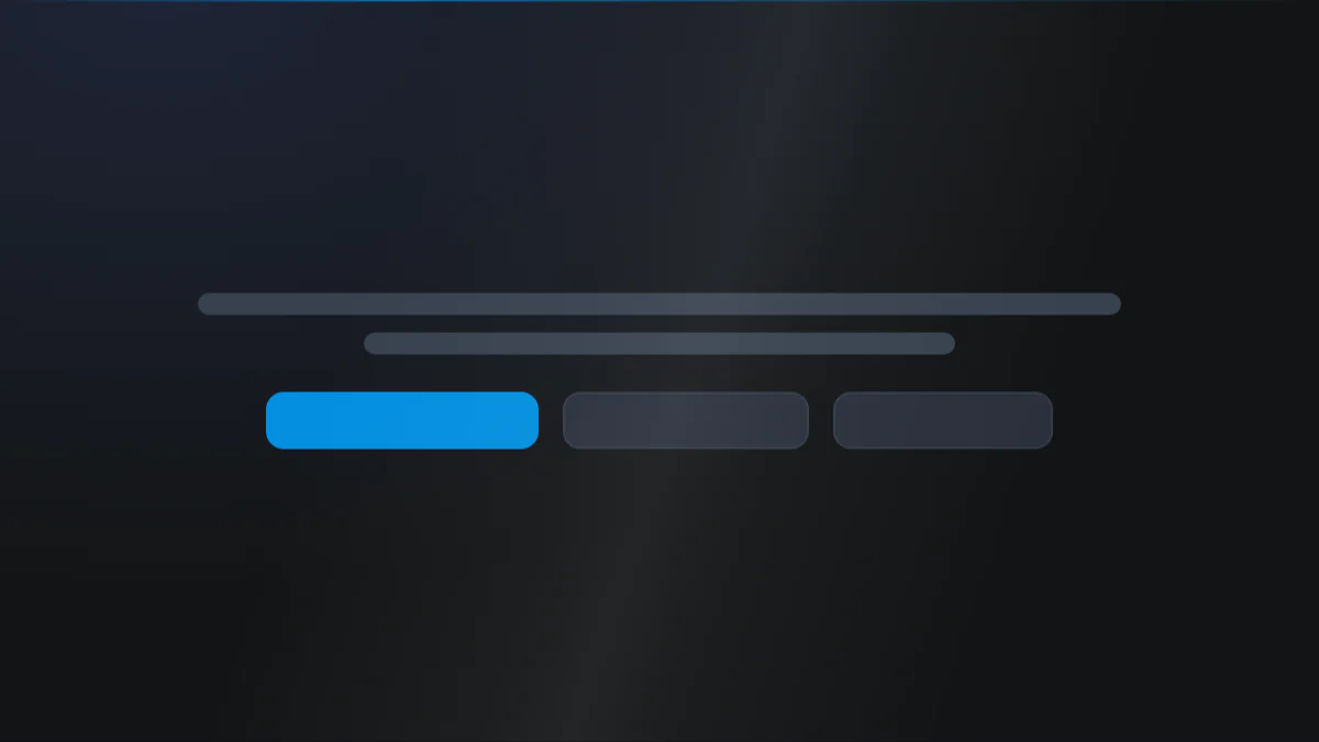
📷 Hero image
Target file: assets/img/buttons/hero.webp
A centered standalone button group on a Light background showing two buttons side by side: a solid Primary button and a lighter secondary button. Include a short supporting microcopy line beneath the pair, such as "No credit card required." Keep the group compact and centered with clean whitespace around it. Captured at desktop width.
At a glance
Buttons CTA Anchor jump
- What it does: renders a horizontal group of buttons that wraps responsively. Each button can be a URL link, an on-page scroll-to-section jump, or a HubSpot CTA, in one of eight preset styles, with an optional icon. An optional supporting heading line can sit above or below the group.
- Best used for: a primary-plus-secondary CTA pair, a "no credit card required" microcopy line under a button, or an anchor jump to another section.
- Not the right fit if: you need a full headline column beside the buttons (use Call to Action) or a lead-capture form (use Form).
- 🔗 Live demo: (add demo link)
Add it to your page
- In the HubSpot page editor, click Add and search for Buttons.
- Drag it where you want the button group.
- Open Click to update content › Buttons and add your first button: set its Type, Title, and Style.
- Turn on Add icon if you want an icon before or after the label.
- Optionally turn on Show heading and write a supporting line, then choose Heading position (above or below).
- Under Style › Preset Settings › Buttons, set the gaps and button size.
- Under Style › Alignment, set Content alignment to place the group left, center, or right.
Design recipes
Each recipe is a look plus the exact fields to reproduce it.
Two buttons side by side, centered.
📷 Result
Target file: recipe-primary-secondary-pair.webp
Two centered buttons side by side: a solid Primary button next to a lighter secondary button, with even whitespace around the pair.
| Field | Set to |
|---|---|
| Button 1 › Style | btn-1 |
| Button 2 › Style | btn-2 |
| Alignment › Content alignment | center |
A button group with a reassuring line beneath it.
📷 Result
Target file: recipe-cta-microcopy.webp
A button group with a small reassuring line such as "No credit card required." sitting directly beneath the buttons, tightly spaced.
| Field | Set to |
|---|---|
| Content › Show heading | on |
| Content › Heading | e.g. "No credit card required." |
| Content › Heading position | below |
| Preset Settings › Heading › Spacing below element | m |
An arrow or icon after each label.
📷 Result
Target file: recipe-buttons-with-icons.webp
Buttons each carrying a small icon or arrow just after the label text, with a tight gap between the text and the icon.
| Field | Set to |
|---|---|
| Button › Add icon | on |
| Button › Icon position | after |
| Preset Settings › Buttons › Spacing between icon and text | gap-s |
Buttons stretch and stack on phones.
📷 Result
Target file: recipe-full-width-mobile-stack.webp
A narrow mobile-width frame showing the buttons stretched to full width and stacked vertically, one above the other with an even gap between them.
| Field | Set to |
|---|---|
| Preset Settings › Buttons › Make button full width [mobile] | on |
| Preset Settings › Buttons › Gap between buttons › Mobile | gap-m |
"I want to..." quick reference
| Goal | Setting |
|---|---|
| One primary CTA | Add a single button, Style = btn-1 |
| Primary + secondary pair | Two buttons, Style btn-1 / btn-2 |
| Center the buttons | Alignment › Content alignment = center |
| Icon after the label | Button › Add icon + Icon position = after |
| Icon before the label | Button › Add icon + Icon position = before |
| Wider gap between buttons | Buttons › Gap between buttons (desktop / mobile) |
| Tighten text-to-icon spacing | Buttons › Spacing between icon and text |
| Stack buttons on phones | Buttons › Make button full width [mobile] |
| Scroll to a section on click | Button › Type = drag_to_section + Section name |
| Embed a HubSpot CTA | Button › Type = cta + choose CTA |
| Add a "No credit card required" line | Content › Show heading + Heading text |
| Put the line above the buttons | Heading position = above |
| Make the heading bold | Preset Settings › Heading › Make font bold |
| Change the button size | Preset Settings › Buttons › Button size |
| Switch the section to a dark palette | Style › Color scheme = dark |
| Screen-reader friendly label | Button › Accessibility label (aria-label) |
| Anchor this whole block | Drag to section name › Section name |
Field reference
The editor is organized into a Content tab and a Style tab. Full field lists are grouped exactly as they appear in HubSpot. (128 fields total - expand each group as needed.)
Content tab
Click to update content
| Field | Type | Default |
|---|---|---|
| Add heading / Heading | boolean / text | off |
| Heading position | choice (above / below) | below |
| Buttons (repeater) | group | - |
Buttons (per button): Type (link / drag_to_section / cta), Link / Section name / CTA, Style (btn-1 to btn-8, default btn-1), Title, optional Icon (before/after), and an accessibility label. Email and phone links auto-prefix to mailto: / tel:.
Section background settings + Drag to section name + Developer
- Section background:
none/color/image/video. Gradients are no longer a separate Type: choosecolor, then set the Style tab Color field tocustom_gradient. (Style tab adds overlay, position, blur, parallax, and dual radial glows.) - Drag to section name: custom section ID for scroll-to-section links.
- Developer use only: per-module custom CSS field.
Style tab
Color scheme
| Field | Options | Default |
|---|---|---|
| Color scheme | light / dark | light |
Drives the section's surface and text tokens. Set the background Type to none (shown as "Default (scheme)") to let the scheme supply the background colour.
Section divider settings
Divider type: none / shape / border / shadow.
- Border divider: from top/bottom/both, width, color (default Tertiary).
- Shadow divider: regular/light/dark/custom shadow with x/y/blur/spread/color.
- Shape divider: 25 shapes, top/bottom/both, flip/invert, color or gradient, responsive heights.
Section spacing settings
| Field | Options | Default |
|---|---|---|
| Top | top-y-0 to top-4xl, or custom | top-y-0 |
| Custom top [desktop / tablet / mobile] | number | 80 / 60 / 40 |
| Bottom | bottom-y-0 to bottom-4xl, or custom | bottom-y-0 |
| Custom bottom [desktop / tablet / mobile] | number | 80 / 60 / 40 |
| Left | left-x-0 / left-m / left-l / left-xl | left-m |
| Right | right-x-0 / right-m / right-l / right-xl | right-m |
Choosing custom on Top or Bottom reveals the three per breakpoint number fields.
Alignment
| Field | Options | Default |
|---|---|---|
| Content alignment | left / center / right | left |
Applies to both the heading and the button row.
Layout settings
- Section wrapper container: default / full-width / 8 presets 384px to 1152px / custom (per breakpoint) + block alignment.
- Inner content container: independent inner width + alignment.
- Maximum content width for element: separate caps for the Heading and the Buttons, each with its own block alignment.
- Enable min height / Min height: give the section a fixed minimum height.
- Vertical content alignment: how the content sits inside that min height.
Preset Settings - Buttons
| Field | Options | Default |
|---|---|---|
| Gap between buttons [desktop / mobile] | gap-0 to gap-4xl | gap-m |
| Buttons › Spacing between icon and text | gap-0 to gap-4xl | gap-m |
| Buttons › Button size | regular / small / large | regular |
| Buttons › Make button full width [mobile] | boolean | off |
| Simple link › Color | default / custom | default |
| Simple link › Icon width and height | number | 16 |
| Simple link › Spacing between icon and text | gap-0 to gap-4xl | gap-m |
| Simple link › Add underline | boolean + offset | off |
| Simple link › Make font bold | boolean | off |
Any button set to the Simple Link style (btn-7) switches to the Simple link controls above instead of the Buttons ones; button size and full width on mobile only apply to the other seven skins.
Alignment lives in its own Alignment group, not here.
Preset Settings - Heading
| Field | Options | Default |
|---|---|---|
| Show heading as | h4 / h5 / h6 / typo-1 / typo-2 / p | p |
| Spacing below element | default / 0 / s / m / l / xl / 2xl / 3xl / 4xl | default |
| Color | default / custom_color / custom_gradient | default |
| Custom text color | color | #FFFFFF |
| Custom text gradient color | gradient | white to white |
| Make font bold | boolean | off |
Tips & gotchas
Reusable anywhere
Because it is a standalone block, this module drops onto any page, blog post, or landing page. Use it for a repeatable "Book a demo" CTA without rebuilding a full band each time.
CTA buttons ignore the aria-label
HubSpot CTA-type buttons render their own markup, so the Accessibility label field does not apply to them. It works on link and drag_to_section buttons.
Anchor jumps need a matching Section name
A drag_to_section button scrolls to the section whose Section name matches. Set that name on the target section (via its Drag to section name group) using lowercase letters and underscores.
Related modules
- Call to Action: when the buttons need a full headline and copy column.
- Form: to capture leads instead of just linking out.
- Section Title: a heading block to place above a button row.