Blog Section
A responsive grid of automatically pulled blog posts - recent, popular, or by tag - drawn in one of three layouts: simple cards, image overlay, or horizontal. Best for: blog index sections, "latest articles" / "from the blog" blocks on landing pages, site pages, and blog templates.
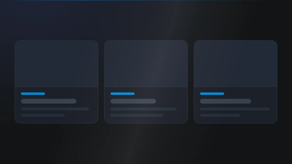
📷 Hero image
Target file: assets/img/blog-section/hero.webp
An automatically pulled blog feed drawn as a three-column card grid on a Light background. Each simple card shows a featured image on top, tag chips, a bold Dark title, a meta row with date and read time, a short excerpt, and the author with a read-more link. Show a full row of three cards at desktop width. Captured at desktop width.
At a glance
Blog Feed Cards Grid
- What it does: fetches posts from a chosen blog (recent, popular, or by tag) and renders them in a responsive column grid. Each post shows a featured image with hover zoom, tags (inline or overlaid), title, meta row (date + read time), excerpt, author, and a read-more link. The whole card can be clickable.
- Best used for: dropping a live blog feed anywhere on a landing page or site page without hand-entering posts.
- Not the right fit if: you want a curated feed with a built-in section header and five card designs (use Blog Post - Recent Post), or the full post loop on a blog index (use Blog Listing).
- 🔗 Live demo: (add demo link)
Add it to your page
- In the HubSpot page editor, click Add and search for Blog Section.
- Drop it where you want the feed to appear.
- Under Click to update content, choose a Blog and a Blog type (recent / popular / recent tag posts).
- Pick a Blog layout (simple / overlay / horizontal) and set No. of blogpost.
- Toggle the post elements you want: featured image, tags, author, publish date, description, read time.
- Set your grid Columns and style the card in the Style tab.
Design recipes
Each recipe is a look plus the exact fields to reproduce it.
Image stacked above the post content, 3-up on desktop.
📷 Result
Target file: recipe-simple-cards-default.webp
Three cards in a row, each with the featured image stacked above the tags, title, meta row, excerpt, and author, pulled from recent posts on a Light background.
| Field | Set to |
|---|---|
| Content › Blog layout | simple |
| Content › Blog type | recent_blogpost |
| Layout › Columns › Desktop / Tablet / Mobile | 3 / 2 / 1 |
Content sitting over a full-bleed background image.
📷 Result
Target file: recipe-overlay-feed.webp
Cards where the post content sits over a full-bleed featured image with a mid-strength overlay, and the title and excerpt in Light text pinned to the bottom.
| Field | Set to |
|---|---|
| Content › Blog layout | overlay |
| Overlay card › Overlay › Overlay | Default |
| Overlay card settings › Vertical content position | bottom |
The most-popular posts within a time window.
📷 Result
Target file: recipe-popular-posts.webp
A three-card feed showing the most-popular all-time posts, each simple card with featured image, title, meta, and excerpt on a Light background.
| Field | Set to |
|---|---|
| Content › Blog type | popular_blogpost |
| Content › Popular from | popular_all_time |
| Content › No. of blogpost | 3 |
Semi-transparent cards with a frosted backdrop.
📷 Result
Target file: recipe-glass-cards.webp
Cards with a semi-transparent custom-color background and a frosted backdrop blur, so the section background shows softly through each card. Best shown over an image or gradient background.
| Field | Set to |
|---|---|
| Card › Make a card | on |
| Card › Background › Background | custom_color (semi-transparent) |
| Card › Background › Add backdrop blur | on |
"I want to..." quick reference
| Goal | Setting |
|---|---|
| Show most recent posts | Content › Blog type = recent_blogpost |
| Show most popular posts | Content › Blog type = popular_blogpost + Popular from window |
| Show posts from specific tags | Content › Blog type = recent_tag_posts + add Tags |
| Image stacked above text | Content › Blog Layout = simple |
| Content over a background image | Content › Blog Layout = overlay |
| Image beside the text | Content › Blog Layout = horizontal |
| Show the author with photo | Content › Author + Show author avatar |
| Tag badge on the image | Content › Tag on + Tag position = overlay (simple layout) |
| Show the read-more link | Content › Show button (off by default), then set Default labels › Read more button |
| Make only the title clickable | Content › Whole card clickable off |
| 3-up / 2-up / 1-up columns | Layout › Columns = 3 / 2 / 1 |
| Featured image zoom on hover | Blog featured image › Scaling on hover |
| Control excerpt length | Blog description › Truncate a text after |
Field reference
The editor is organized into a Content tab and a Style tab. Groups below match the HubSpot editor. (258 fields total - expand each group as needed.)
Content tab
Section background settings
| Field | Type | Options | Default |
|---|---|---|---|
| Type | choice | none / color / gradient / image / video | none |
| Upload background image | image | - | - |
| Video | file | - | - |
Click to update content
| Field | Type | Default |
|---|---|---|
| Choose a blog | blog | - |
| Blog type | choice (recent / popular / recent tag posts) | popular_blogpost |
| Blog Layout | choice (simple / overlay / horizontal) | simple |
| No. of blogpost | number | 6 |
| Tag position | choice (inline / overlay) | inline |
| Date format | choice (version 1 to 6) | version_1 |
| Popular from | choice (all time / year / 6 months / month) | popular_all_time |
| Whole card clickable | boolean | on |
Element toggles: featured image (on), tag, author, author avatar, publish date, title (on), blog description (on), read time. Default labels: read more button, author prefix, read time label, meta separator.
Style tab
Color scheme
| Field | Options | Default |
|---|---|---|
| Color scheme | light / dark | light |
Drives the section's surface and text tokens. Set the background Type to none (shown as "Default (scheme)") to let the scheme supply the background colour.
Section background settings
Background Color: Primary, Secondary, Tertiary, Light, Dark, White, Black, White transparent, or a custom color or custom gradient (default bg-light). Image / video overlay (none / solid / gradient, plus a custom overlay color or gradient) and position, blur, parallax (scale + speed), and two radial glows (color token or custom, position, size, opacity).
Section divider settings
Divider type: none / shape / border / shadow.
- Border divider: from top / bottom / both, width, color (default Tertiary token).
- Shadow divider: regular / light / dark / custom shadow with x / y / blur / spread / color.
- Shape divider: 25 shapes, top / bottom / both, flip / invert, color or gradient, responsive heights.
Section spacing settings
| Field | Options | Default |
|---|---|---|
| Top | top-y-0 to top-4xl | top-xl |
| Bottom | bottom-y-0 to bottom-4xl | bottom-xl |
| Left | left-x-0 / left-m / left-l / left-xl | left-m |
| Right | right-x-0 / right-m / right-l / right-xl | right-m |
Top and Bottom also accept custom, which reveals Custom top / Custom bottom number fields for desktop, tablet, and mobile (defaults 80 / 60 / 40).
Layout settings
- Columns: large / medium / small (default
3/2/1) plus a gap per breakpoint. - Section wrapper container: default / full-width / 8 presets 384px to 1152px / custom per breakpoint + block alignment.
- Inner content container: independent inner width + alignment.
Card
- Alignment: content alignment (left / right / center).
- Overlay card settings: only reached by the Overlay layout.
- Ratio of card:
Autoby default, so the card grows with its padding and text. That suits a feed where one post has a two line title and the next has five. Pick an aspect ratio (16:9 through 9:21) to hold every card to the same shape, orCustom heightto set an exact height per breakpoint (desktop, tablet, mobile). - Vertical content position: top, center or bottom (default
bottom). It only has an effect once a ratio or a custom height is set, because withAutothe card has no spare vertical space to move the text within. - Overlay tint, image zoom on hover, border, round corner, shadow and card padding.
- Ratio of card:
- Make a card: off by default. Background (color / gradient / custom) with optional backdrop blur, border, responsive padding, shadow, round corner (default
round-s). - Horizontal layout settings: image width percent, image-to-content gap (
gap-0togap-4xl), collapse breakpoint, vertical alignment.
Preset Settings - image, title, description, meta
| Field | Type | Default |
|---|---|---|
| Blog featured image › Image ratio | choice (9 ratios / custom height) | aspect-16by9 |
| Blog featured image › Scaling on hover | number | 1.04 |
| Blog Title › Show blog title as | h1 to h6 | h5 |
| Blog description › Truncate a text after | number | 100 |
| Meta row › Spacing under meta row | sb-0 to sb-4xl | sb-m |
Publish date, read time, and author each carry font size, transform, color (token), and spacing under element. The meta row controls gaps between tag, date, and read time.
Preset Settings - Blog tag & Link
- Blog tag: max tags, background (color / gradient), text color, font size, bold, letter spacing, transform, round corner, padding, gap, backdrop blur, overlay offsets.
- Link: font style, text color, heading level, optional icon with size and gap (
gap-0togap-4xl), underline, bold, spacing under element.
Developer use only
Add custom CSS here: per-module CSS injection field.
Tips & gotchas
Round corner is showing but nothing changes?
Round corner and Spacing below element on the featured image apply when Blog layout is Simple. With Horizontal and Overlay they are still listed, but they have no effect there (Overlay turns the image into the card background, and Horizontal has no gap below the image).
Set the corner from the card's own Round corner instead when you are in that layout.
They are hidden only when a card is switched on and its padding is set to Content only, because the image then bleeds to the card edges and takes the card's radius. With Card UI off they always stay available.
Horizontal works best narrow
The horizontal layout places the image beside the text, so it reads best at 1 to 2 Columns. It collapses to vertical below the Responsive breakpoint for stacking breakpoint.
Popular window only affects Popular
Popular from (all time / year / six months / month) only applies when Blog type is set to popular_blogpost. For recent or tag feeds it has no effect.
Curated header lives elsewhere
Blog Section has no built-in title block. If you want a subtitle pill, highlightable title, and description above the feed, use Blog Post - Recent Post or add a Section Title module above.
Frequently asked questions
Can I combine Popular posts with a tag filter?
Yes. Content › Tags appears whenever Blog type isn't set to Recent blogpost, so it's available for both Popular blogpost and Recent tag posts, narrowing the popular feed down to specific tags.
Is there a limit to how many posts I can pull in?
Yes, 1 to 20. Content › No. of blogpost caps out at 20 posts per instance of the module.
Does clicking anywhere on the card open the post, or only the title?
That's a toggle. Whole card clickable is on by default, so the entire card links to the post. Turn it off to restrict the click target to just the title and read-more link.
Does the Overlay tag position work with every Blog layout?
No. Tag position › Overlay places the tag on top of the featured image, but that only applies in the Simple layout. In Horizontal or Overlay layout, use the Inline position instead.
Can I pull posts from more than one blog in a single instance of this module?
No. Choose a blog picks a single blog. Add a second Blog Section instance if you need to show posts from another blog alongside it.
Is there a limit on how many tags I can filter by?
No. Content › Tags has no minimum or maximum, so add as many tags as you need when Blog type is set to pull from tags.
Related modules
- Blog Post - Recent Post: the same feed with a section header and five card designs.
- Blog Listing: the full post loop for a blog index page.
- Tag filter: a topic filter bar to pair with the feed.
- Pagination: the numbered pager for listing pages.