Blog Listing
The main post loop for a blog index. It renders every post the blog returns as a configurable grid or stacked list of cards - featured image, tags, title, excerpt, date, read time, author, and a read-more link. Best for: blog index pages, "latest articles" / "from the blog" sections, recent-news listings driven by the HubSpot blog.
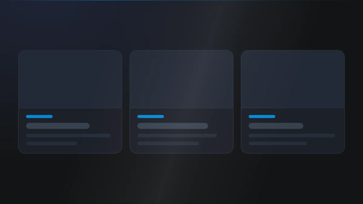
📷 Hero image
Target file: assets/img/blog-listing/hero.webp
A blog index post loop drawn as a three-column card grid on a Light background. Each card shows a rounded featured image on top, then tag chips, a bold Dark title, a short excerpt, and a footer row with the author and a read-more link. Show a full row of three cards at desktop width. Captured at desktop width.
At a glance
Blog Listing Cards Grid
- What it does: loops over the blog's posts and draws each one with a chosen card design. Two layouts are available: Simple (image above the text) and Horizontal (image beside the text).
- Best used for: the primary post feed on a blog index or a resource-center listing page, where every post in the blog should appear.
- Not the right fit if: you want to hand-pick a few recent or popular posts inside a landing page (use Blog Section or Blog Post - Recent Post).
- 🔗 Live demo: (add demo link)
Add it to your page
- Open a Blog listing template in the HubSpot editor.
- Click Add and search for Blog Listing, then drop it where the post loop belongs.
- In the Style tab, pick a Blog layout (Simple or Horizontal).
- Toggle the post elements you want: featured image, publish date, read time, tags, description, author.
- Set your grid Columns per breakpoint in Layout settings.
- Style the card and each element in the Style tab, then set up Pagination below the loop.
Design recipes
Each recipe is a look plus the exact fields to reproduce it.
Image-top cards with a footer holding the author and read-more link.
📷 Result
Target file: recipe-card-grid-default.webp
Three image-top cards in a row, each with a divider above a footer that holds the author name and a read-more link, on a Light background.
| Field | Set to |
|---|---|
| Style › Blog layout | Simple |
| Layout › Columns › Desktop / Tablet / Mobile | 3 / 2 / 1 |
| Card › Image zoom on hover | on |
| Card › Footer › Show divider | on |
Image beside the text, with a wider text column.
📷 Result
Target file: recipe-horizontal-stack.webp
A post row with the featured image on the left and a wider text column on the right holding the tags, title, excerpt, and author, with the image taking 40 percent of the row.
| Field | Set to |
|---|---|
| Style › Blog layout | Horizontal |
| Horizontal layout settings › Image width | 40 (percent) |
| Horizontal layout settings › Vertical alignment › Alignment | top |
"I want to..." quick reference
| Goal | Setting |
|---|---|
| Pick the card layout | Style › Blog layout |
| 3-up / 2-up / 1-up columns | Layout › Columns = 3 / 2 / 1 |
| Show estimated read time | Content › Show read time (+ read time label / meta separator) |
| Hide the featured image | Content › Show featured image off |
| Image grows on hover | Card › Image zoom on hover + Zoom scale |
| Image beside text, text wider | Style › Blog layout = Horizontal, then Horizontal layout settings › Image width |
| Read-more as a button | Detail page link › How you want to show a link? = Button |
| Add an arrow to the read-more | Detail page link › Add icon |
| Divider above the card footer | Card › Footer › Show divider |
| Limit excerpt length | Description › How many character you have to show in description? |
Field reference
The editor is organized into a Content tab and a Style tab. Groups below match the HubSpot editor. (375 fields total - expand each group as needed.)
Content tab
Section background settings
| Field | Type | Options | Default |
|---|---|---|---|
| Type | choice | none / color / gradient / image / video | none |
| Upload background image | image | - | - |
| Video | file | - | - |
Click to update content
| Field | Type | Default |
|---|---|---|
| Blog layout | choice (Simple / Horizontal) | simple |
| Show featured image / publish date / tags / description / author | boolean | on |
| Show read time | boolean | on |
Default labels: Read more button (Read more), Author prefix (By), Read time label (min read), Meta separator (a small dot).
Style tab
Color scheme
| Field | Options | Default |
|---|---|---|
| Color scheme | light / dark | light |
Drives the section's surface and text tokens. Set the background Type to none (shown as "Default (scheme)") to let the scheme supply the background colour.
Section background settings
Background Color: Primary, Secondary, Tertiary, Light, Dark, White, Black, White transparent, or a custom color or custom gradient (default bg-light). Image / video overlay (none / solid / gradient, plus a custom overlay color or gradient) and position, blur, parallax (scale + speed), and two radial glows (color token or custom, position, size, opacity).
Section divider settings
Divider type: none / shape / border / shadow.
- Border divider: from top / bottom / both, width, color (default Tertiary token).
- Shadow divider: regular / light / dark / custom shadow with x / y / blur / spread / color.
- Shape divider: 25 shapes, top / bottom / both, flip / invert, color or gradient, responsive heights.
Section spacing settings
| Field | Options | Default |
|---|---|---|
| Top | top-y-0 to top-4xl | top-xl |
| Bottom | bottom-y-0 to bottom-4xl | bottom-xl |
| Left | left-x-0 / left-m / left-l / left-xl | left-m |
| Right | right-x-0 / right-m / right-l / right-xl | right-m |
Top and Bottom also accept custom, which reveals Custom top / Custom bottom number fields for desktop, tablet, and mobile (defaults 80 / 60 / 40).
Layout settings
- Columns: large / medium / small (default
3/2/1) plus a gap per breakpoint. - Horizontal stack layout: width ratio (
1fr 1frto7fr 3fr), stacking breakpoint, arrangement (media-first or content-first), image-to-content gap, spacing between stacks, meta-row gap. - Section wrapper container: default / full-width / 8 presets 384px to 1152px / custom per breakpoint + block alignment.
- Inner content container: independent inner width + alignment.
Preset Settings - Featured image, date, title, description
| Field | Type | Default |
|---|---|---|
| Featured image › Ratio of image | choice (9 ratios / custom height) | aspect-16by9 |
| Featured image › Round corner | round-0 to round-xxl / custom | round-xl |
| Featured image › Shadow | none / light / regular / dark | none |
| Publish date › Date print like | choice (9 formats) | MM/dd/yyyy |
| Title › Show title as | h1 to h6 | h5 |
| Description › How many character... | number | 110 |
Each element group also carries color (token), spacing under element (Default / 0 / S / M / L / XL / 2XL / 3XL / 4XL), text transform, and font style controls.
Preset Settings - Tag, Author, Detail page link, Overlay tag
- Tag chips: background (color / gradient / none), border, round corner, typography, spacing between tags.
- Author: name typography, avatar size and round corner, photo-to-name spacing, author prefix text.
- Detail page link: simple text link or button (
btn-1tobtn-8), independently styled. Simple link: color, underline + offset, bold, icon size. Button: icon-to-text gap, full-width on mobile. - Overlay tag (on image): max tags, background, text color, round corner, padding, top / left offset, backdrop blur.
Card
Wrap each post in a card (on by default). Controls: image zoom on hover + scale, background (color / gradient / custom) with optional backdrop blur, border, responsive padding, shadow (default none), round corner (default round-m), and a footer divider above the author + read-more row.
Developer use only
Add custom CSS here: per-module CSS injection field.
Tips & gotchas
Round corner is showing but nothing changes?
Round corner and Spacing below element on the featured image apply when Blog layout is Simple. With Horizontal they are still listed, but they have no effect, because there is no gap below the image in that layout.
Set the corner from the card's own Round corner instead when you are in that layout.
They are hidden only when a card is switched on and its padding is set to Content only, because the image then bleeds to the card edges and takes the card's radius. With Card UI off they always stay available.
Match columns to the layout
The Horizontal layout reads best at 1 to 2 columns, and Simple shines at 3-up on desktop. Set Columns to suit the layout you picked.
This is the full loop, not a curated feed
Blog Listing renders every post the blog returns for the page. To hand-pick recent, popular, or tag-filtered posts inside a landing page, use Blog Section or Blog Post - Recent Post instead.
Pagination
The numbered page navigation for a blog listing - page numbers plus optional Previous/Next and First/Last controls, each fully styleable for simple and hover/active states. Best for: the pager at the bottom of a blog index / listing page, paged news or article archives.
📷 Hero image
Target file: assets/img/blog-pagination/hero.webp
A centered numbered pager sitting below a blog listing on a Light background. Show a windowed run of page numbers with the current page highlighted in a filled Dark box with Light text, and the other numbers as plain boxes. Captured at desktop width. Frame it tightly on the pager row so the controls read clearly.
At a glance
Blog Pagination Pager
- What it does: builds an accessible pager from the blog's page count. It shows a windowed run of page numbers (the current page stays centered), plus optional Previous/Next and First/Last controls rendered as text labels or built-in arrow icons. Each control group has its own spacing, size, border, round corner, and separate simple and hover/active colors.
- Best used for: the page navigation below a Blog Listing loop on a blog index.
- Not the right fit if: you are curating a fixed set of posts with no paging (use Blog Section). For a topic filter rather than page numbers, see Tag filter below.
- 🔗 Live demo: (add demo link)
Where to find it
Pagination is part of Blog Listing, not a separate module, so there is nothing to add. Its settings live in this module.
- Open the page using the Blog Listing module.
- Under Click to update content, turn on Show numbers.
- Optionally set Previous and next and First and last numbers to show arrows or labels.
- Edit the First / Last / Prev / Next label text if you chose labels.
- Style each control group's box, border, and simple / hover-active colors in the Style tab.
Design recipes
Each recipe is a look plus the exact fields to reproduce it.
A clean row of page numbers with an active-state highlight.
📷 Result
Target file: recipe-numbers-only-default.webp
A centered row of page numbers with the current page filled in a Dark box and Light text, the rest plain, on a Light background.
| Field | Set to |
|---|---|
| Content › Show numbers | on |
| Numbers › Alignment › Pagination alignment | justify-center |
| Numbers › Hover & active state › Background color | Dark token |
Page numbers flanked by Previous/Next arrow icons.
📷 Result
Target file: recipe-numbers-arrows.webp
The page-number row with a Previous arrow icon on the left and a Next arrow icon on the right, framing the numbers.
| Field | Set to |
|---|---|
| Content › Previous and next | show_arrows |
| Previous and next › Icons settings › Icon style | opt_1 |
| Previous and next › Icons settings › Icon stroke width | 1.65 |
First / Prev / numbers / Next / Last with text labels.
📷 Result
Target file: recipe-full-controls.webp
A full pager reading First, Prev, the page numbers, Next, and Last as text labels rather than arrows, all in one centered row.
| Field | Set to |
|---|---|
| Content › First and last numbers | show_labels |
| Content › Previous and next | show_labels |
| Content › First label / Last label | First / Last |
Auto-width rounded boxes with a filled active state.
📷 Result
Target file: recipe-pill-buttons.webp
Fully rounded, bordered auto-width page boxes with the current page filled as a solid pill, giving a button-like pager.
| Field | Set to |
|---|---|
| Numbers › Spacing › Spacing applied on | auto_width |
| Numbers › Round corner › Round corner | round-100 |
| Numbers › Border › Show border | on |
"I want to..." quick reference
| Goal | Setting |
|---|---|
| Show page numbers | Content › Show numbers |
| Add Prev/Next arrows | Content › Previous and next = show_arrows |
| Add First/Last jumps | Content › First and last numbers = show_arrows or show_labels |
| Use text labels instead of arrows | Set the control to show_labels (edit label text) |
| Equal square buttons | Numbers › Spacing › Spacing applied on = fixed_width |
| Pill-shaped buttons | Numbers › Round corner = round-100 (or custom) |
| Highlight the current page | Numbers › Hover & active state colors |
| Center / left / right the pager | Numbers › Alignment › Pagination alignment |
| Pick the arrow look | Icons settings › Icon style (opt_1 / opt_2) |
| Outlined buttons | Numbers › Border › Show border + state border colors |
Field reference
These fields sit inside the Blog Listing module and are counted in its 375, listed here separately because they control one distinct piece of the listing.
Content tab
Section background settings
| Field | Type | Options | Default |
|---|---|---|---|
| Type | choice | none / color / gradient / image / video | none |
| Upload background image | image | - | - |
| Video | file | - | - |
Click to update content
| Field | Type | Default |
|---|---|---|
| Show numbers | boolean | on |
| First and last numbers | choice (do not print / show arrows / show labels) | do_not_print |
| First label / Last labels | text | First / Last |
| Previous and next | choice (do not print / show arrows / show labels) | do_not_print |
| Previous label / Next label | text | Prev / Next |
Style tab
Section background settings
Background Color: Primary, Secondary, Tertiary, Light, Dark, White, Black, White transparent, or a custom color or custom gradient (default bg-light). Image / video overlay (none / solid / gradient, plus a custom overlay color or gradient) and position, blur, parallax (scale + speed), and two radial glows (color token or custom, position, size, opacity).
Section divider settings
Divider type: none / shape / border / shadow.
- Border divider: from top / bottom / both, width, color (default Tertiary token).
- Shadow divider: regular / light / dark / custom shadow with x / y / blur / spread / color.
- Shape divider: 25 shapes, top / bottom / both, flip / invert, color or gradient, responsive heights.
Section spacing settings
| Field | Options | Default |
|---|---|---|
| Top | top-y-0 to top-4xl | top-xl |
| Bottom | bottom-y-0 to bottom-4xl | bottom-xl |
| Left | left-x-0 / left-m / left-l / left-xl | left-m |
| Right | right-x-0 / right-m / right-l / right-xl | right-m |
Layout settings
- Section wrapper container: default / full-width / 8 presets 384px to 1152px / custom per breakpoint + block alignment.
- Inner content container: independent inner width + alignment.
Elements settings - Numbers
| Field | Type | Default |
|---|---|---|
| Alignment › Pagination alignment | justify-center / start / end | justify-center |
| Spacing › Spacing option | fixed_width / auto_width | auto_width |
| Width & height of box [desktop / mobile] | number | 32 / 32 |
| Font size [desktop / mobile] | number | 14 / 14 |
| Round corner | round-0 to round-100 / custom | round-m |
| Spacing between numbers | number | 10 |
Simple state and Hover & active state each set background (color / gradient / none), text color, and border color. The active page uses the hover/active colors (defaults: Dark background, White text).
Elements settings - First and last numbers
Same box / spacing / font / border / round corner controls as Numbers, plus an Icons settings group: icon style (opt_1 / opt_2), icon size (desktop / mobile), and stroke width. Separate Simple state and Hover state & active state colors.
Elements settings - Previous and next
Mirrors the First and last group: box / spacing / font / border / round corner, an Icons settings group (icon style, size, stroke width), and separate Simple state and Hover state colors.
Developer use only
Add custom CSS here: per-module CSS injection field.
Tips & gotchas
The active page reuses the hover style
There is no separate "active page" color group. The current page picks up the Hover & active state colors, so style those to highlight where the visitor is.
It hides itself on a single page
The pager only renders when the blog has more than one page. If nothing appears, the listing likely fits on one page.
Fixed vs auto width
Spacing option = fixed_width gives every item an equal square box (great for numbered squares); auto_width lets each box hug its content (better for labeled Prev / Next buttons).
Tag filter
A blog tag / topic filter for listing pages - it renders the blog's tags as a row of clickable pills or as a dropdown so visitors can filter posts by topic. Best for: blog listing headers, resource-center category filters, "filter by topic" bars above a post grid.
📷 Hero image
Target file: assets/img/blog-tags/hero.webp
A blog topic filter bar rendered as a horizontal row of clickable tag pills on a Light background, sitting above a post grid. Show an "All articles" pill plus several topic pills, with the active pill filled in the Primary color and Light text while the rest stay plain. Captured at desktop width. Frame it tightly on the filter row.
At a glance
Blog Tags Filter
- What it does: pulls the blog's tags and renders them as a sorting control. Two modes: a row of clickable tag links or a single dropdown select. In pill mode the tags collapse into a responsive select box below a chosen breakpoint. An "All articles" entry always clears the filter, and the active tag is highlighted automatically.
- Best used for: the topic filter bar above a Blog Listing loop, letting visitors narrow posts by tag.
- Not the right fit if: you want page navigation instead of a topic filter (see Pagination above), or a full post feed rather than a filter (use Blog Section).
- 🔗 Live demo: (add demo link)
Where to find it
The tag filter is part of Blog Listing, not a separate module, so there is nothing to add. Its settings live in this module.
- Open the page using the Blog Listing module.
- Under Click to update content, set Show blog sorting as (dropdown / clickable tag / none).
- Rename the All articles entry under Default labels if you like.
- Style the pills or the dropdown in the Style tab, including simple and active states.
- For pill mode, set the Show as a select box below breakpoint so tags collapse gracefully on narrow screens.
Design recipes
Each recipe is a look plus the exact fields to reproduce it.
A horizontal row of tag links with a filled active pill.
📷 Result
Target file: recipe-clickable-pills-default-row.webp
A single row of tag pills with the active tag filled in the Primary color and Light text, the rest plain, evenly spaced on a Light background.
| Field | Set to |
|---|---|
| Content › Show blog sorting as | clickable_tag |
| Clickable tag › Active state › Background color | bg-primary |
| Clickable tag › Spacing between tags | 8 |
Bordered pills that fill in when active.
📷 Result
Target file: recipe-outlined-pills.webp
Tag pills outlined with a Primary border, where the active tag fills solid in the Primary color with Light text.
| Field | Set to |
|---|---|
| Clickable tag › Show border | on |
| Clickable tag › Simple state › Border color | Primary token |
| Clickable tag › Active state › Background color | bg-primary |
A single select box instead of pills.
📷 Result
Target file: recipe-dropdown-filter.webp
A single dropdown select box with a Primary background and a visible arrow, replacing the row of pills as the topic filter.
| Field | Set to |
|---|---|
| Content › Show blog sorting as | dropdown |
| Dropdown › Background color | bg-primary |
| Dropdown › Make select box in full width [mobile] | on |
Pills on desktop that fold into a select box at tablet.
📷 Result
Target file: recipe-responsive-collapse.webp
A side-by-side idea: the pill row at desktop width and the same filter collapsed into a full-width select box at tablet width.
| Field | Set to |
|---|---|
| Content › Show blog sorting as | clickable_tag |
| Responsive selectbox › At which point... | medium_tablet |
| Responsive selectbox › Make select box in full width [mobile] | on |
"I want to..." quick reference
| Goal | Setting |
|---|---|
| Show tags as clickable pills | Content › Show blog sorting as = clickable_tag |
| Show tags as a dropdown | Content › Show blog sorting as = dropdown |
| Hide the sorting control | Content › Show blog sorting as = none |
| Rename the "all" entry | Content › Default labels › All articles |
| Fill the current tag | Clickable tag › Active state › Background color |
| Outline the pills | Clickable tag › Show border + simple / active Border color |
| Round the pills more | Clickable tag › Round corner (or custom px) |
| Space tags further apart | Clickable tag › Spacing between tags |
| Collapse pills to a select on tablet | Responsive selectbox › At which point... |
| Stretch the select box full width | Responsive selectbox / Dropdown › Make select box in full width [mobile] |
| Recolor the dropdown arrow | Dropdown / Responsive selectbox › Select icon color |
| Bold the tag / select text | Clickable tag / Dropdown › Make font bold |
Field reference
These fields sit inside the Blog Listing module and are counted in its 375, listed here separately because they control one distinct piece of the listing.
Content tab
Section background settings
| Field | Type | Options | Default |
|---|---|---|---|
| Type | choice | none / color / gradient / image / video | none |
| Upload background image | image | - | - |
| Video | file | - | - |
Click to update content
| Field | Type | Default |
|---|---|---|
| Show blog sorting as | choice (dropdown / clickable tag / none) | dropdown |
| Default labels › All articles | text | All resources |
Style tab
Section background settings
Background Color: Primary, Secondary, Tertiary, Light, Dark, White, Black, White transparent, or a custom color or custom gradient (default bg-light). Image / video overlay (none / solid / gradient, plus a custom overlay color or gradient) and position, blur, parallax (scale + speed), and two radial glows (color token or custom, position, size, opacity).
Section divider settings
Divider type: none / shape / border / shadow.
- Border divider: from top / bottom / both, width, color (default Tertiary token).
- Shadow divider: regular / light / dark / custom shadow with x / y / blur / spread / color.
- Shape divider: 25 shapes, top / bottom / both, flip / invert, color or gradient, responsive heights.
Section spacing settings
| Field | Options | Default |
|---|---|---|
| Top | top-y-0 to top-4xl | top-xl |
| Bottom | bottom-y-0 to bottom-4xl | bottom-xl |
| Left | left-x-0 / left-m / left-l / left-xl | left-m |
| Right | right-x-0 / right-m / right-l / right-xl | right-m |
Layout settings
- Section wrapper container: default / full-width / 8 presets 384px to 1152px / custom per breakpoint + block alignment.
- Inner content container: independent inner width + alignment.
Elements settings - Clickable tag
| Field | Type | Default |
|---|---|---|
| Spacing around text [desktop / mobile] | spacing | 10px / 7px |
| Round corner | round-0 to round-xxl / custom | round-m |
| Spacing between tags | number | 8 |
| Make font bold | boolean | off |
| Show border + Border width | boolean / number | off / 1 |
Simple state and Active state each set background (color / gradient / none), border color, and text color. The active pill defaults to a Primary background with White text.
Elements settings - Responsive selectbox
Shown in clickable-tag mode below the chosen breakpoint. Controls: collapse breakpoint (small / medium / big tablet), background, text color, border, round corner (default round-s), padding, full-width toggle, and the dropdown arrow (color, size, horizontal shift percent, stroke width).
Elements settings - Dropdown
For the dropdown mode: background (default bg-primary), text color, border, round corner, desktop / mobile padding, bold toggle, box text alignment, full-width-on-mobile toggle, and the dropdown arrow (color, size, separate desktop / mobile shift percent, stroke width).
Developer use only
Add custom CSS here: per-module CSS injection field.
Tips & gotchas
The active tag styles itself
The current tag (matched by its slug) automatically receives the Active state styling, and "All articles" is active when no topic is selected. You only style the states, not each tag.
Responsive collapse is pill-mode only
The Show as a select box below group only applies when Show blog sorting as is clickable_tag. In dropdown mode the tags are always a select box.
Arrow position is a percentage
How many percent you want to shift the icon from right places the dropdown arrow across the box as a percentage. Higher values push it toward the right edge.
Author and tag archive headers
A blog-listing module that adds a centered spotlight header to your Author and Tag archive pages. On an author page it renders the avatar, name, bio, social links, and a post count; on a tag page it renders an icon badge, the tag name, and a post count. Best for: giving author and tag archive pages a proper heading instead of a bare post list.
📷 Hero image
Target file: assets/img/blog-author-tag-page/hero.webp
A centered spotlight header at the top of a blog author listing page on a Light background. Show a round author avatar centered above the author name in a bold Dark heading, followed by a short bio line, with the start of the post grid visible below. Captured at desktop width.
At a glance
Blog Listing Configuration
- What it does: renders a centered spotlight header at the top of a blog listing. On an author page it shows the author avatar, name, bio, social icons, and post count. On a tag page it shows an icon badge, the tag name, and post count. The author and tag content is pulled automatically from HubSpot, so you rarely retype it.
- Best used for: blog Author listing pages and blog Tag listing pages that need a clear, branded header above the post grid.
- Not the right fit if: you want to style individual posts (use Blog Section or Blog Recent Post) or the main blog index header.
- 🔗 Live demo: (add demo link)
This is a configuration module
It lives in the blog listing template and only renders on author or tag pages. The author name, avatar, bio, and social links come from the author record; the tag name comes from the tag. You mostly set labels and styling here.
Where to find it
These headers are part of the blog listing template and appear on their own, so there is nothing to add.
- They stay hidden on the standard blog index and only appear on author or tag pages.
- Set the Post count label for author and tag (for example "Articles") and, for tag pages, choose an Icon for the badge.
- Style the Author page header and Tag page header groups on the Style tab, then save the template.
Common setups
| Goal | Setting |
|---|---|
| Author header with avatar and bio | Renders automatically on any author listing page |
| Tag header with an icon badge | Set the Icon under Click to update content › Tag page header |
| Change "Articles" to your wording | Edit Post count label for author and tag in each header group |
| Bigger author avatar | Style tab › Author page header › Avatar › Avatar size |
| Left-align the header | Style tab › header group › Layout › Alignment = left |
| Section background | Content tab › Section background settings › Type |
Field reference
The editor has a Content tab (labels and background) and a Style tab (the full look of each header).
Content tab
Section background settings
| Field | Type | What it does | Default |
|---|---|---|---|
| Type | choice | Background type for the section: color, image, or video. | color |
| Upload background image | image | Background image when Type is image. | - |
| Video | file | Background video when Type is video. | - |
Click to update content
Author page header
| Field | Type | What it does | Default |
|---|---|---|---|
| Post count label | text | The word after the number in the author post count. | Articles |
Tag page header
| Field | Type | What it does | Default |
|---|---|---|---|
| Icon | icon | The glyph shown in the tag icon badge. | - |
| Post count label | text | The word after the number in the tag post count. | Articles |
Drag to section name / Developer use only
- Section name: an internal label for the drag-to-section arrow target.
- Add custom CSS here: per-module CSS injection field.
Style tab
Author page header
- Layout: alignment (default
center) and intro max width (720). - Avatar: size (132), round corner (default
round-100, fully round) with custom option, ring width (5) and ring color (default white), spacing under (defaultxl). - Name: show name as (default
h1), color, spacing under (defaultl). - Bio: color, max width (640), spacing under (default
xl). - Social icons: icon size (42), style (default
soft), glyph size, gap (gap-l), outline width, corner radius (round-100), active color, spacing under. - Counter: post count color (default
text-secondary), number-to-label gap, padding, border width, corner radius (pill by default), and bold toggles (number bold by default).
Tag page header
- Layout: alignment (default
center) and intro max width (720). - Icon badge: icon size (38), color, corner radius (
round-xl), background color, optional border (on by default) with color and width, spacing around icon (desktop/mobile), spacing under. - Name: show tag name as (default
h3), text transform (defaultcapitalize), color, spacing under. - Counter: same post-count styling as the author counter (color, gap, padding, border, corner radius, bold toggles).
Shared section groups (from the theme's section system)
The header also carries the standard Section background settings, Section divider settings (none / shape / border / shadow), Section spacing settings, and Layout settings (wrapper and inner container widths) found across Flexoraa sections. Defaults suit a light listing header out of the box.
Tips & gotchas
It only shows where it should
The module is gated to author and tag pages, so it will not clutter your main blog index. You do not need to add or remove it per page.
Author content comes from HubSpot
The avatar, name, bio, and social links are read from the author record, not typed into the module. To change them, edit the author in your HubSpot blog settings.
Frequently asked questions
Why does each card only show one tag even when the post has several?
Preset Settings › Tag › Max tags to show defaults to 1. Raise it up to 5 to show more tags per card; extra tags beyond that number stay hidden.
Can I remove the numbered page links and keep just Previous/Next?
Yes. Turn off Pagination › Show numbers. The Previous and Next arrows are controlled separately, so they stay even with numbers off.
Can I add First/Last jump controls next to the page numbers?
Yes. Pagination › First and last numbers is set to "Do not print" by default. Set it to "Show arrows" to add them.
Can the desktop grid show more than 3 columns?
Yes, up to 6. Layout settings › Columns › Desktop accepts 1 to 6, with separate values for tablet (default 2) and mobile.
Can the excerpt be a different length on mobile than on desktop?
No. Description › How many character you have to show in description? is a single value (default 110) that applies at every screen size, not a per-breakpoint field.
Can the featured image use a different aspect ratio in Simple vs Horizontal layout?
No. Preset Settings › Featured image (ratio, height, round corner) is one shared group that applies to both Blog layout options. Only the zoom-on-hover, background, border, shadow, and padding are set separately per layout, under Simple card settings and Horizontal card settings.
Related modules
- Blog Section: an auto-pulled feed (recent / popular / by tag) for landing pages.
- Blog Post - Recent Post: a curated feed with an optional section header and five card designs.