Accordion
A stacked list of expand/collapse question-and-answer items, each with an optional leading icon. Best for: FAQ sections, product and feature detail toggles, support and help blocks, "learn more" collapsibles.
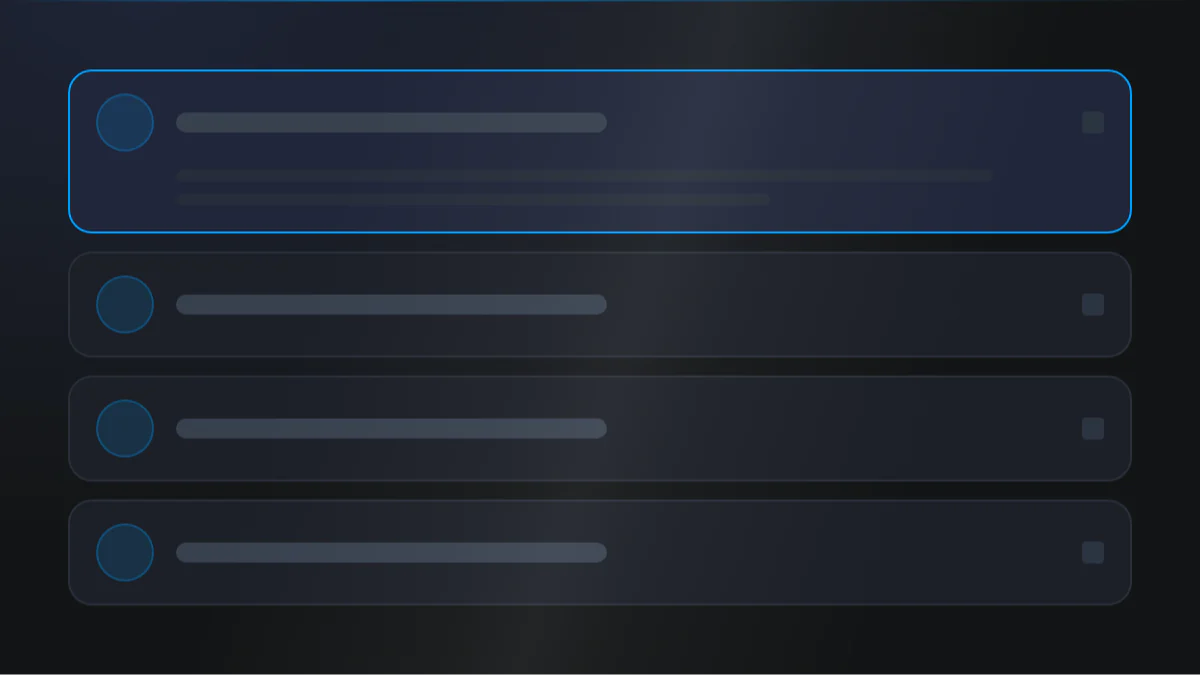
📷 Hero image
Target file: assets/img/accordion/hero.webp
A vertical stack of four to five FAQ rows on a Light background, each row a question in bold Dark text with a chevron indicator on the right. Show the first row expanded to reveal its answer paragraph in a muted body color, with thin divider lines separating the closed rows below. The open row's chevron and title read in the Primary color. Captured at desktop width.
At a glance
FAQ Collapsible Q&A
- What it does: renders a vertical stack of question/answer items. Clicking a question expands or collapses its rich-text answer, with a configurable indicator (plus, arrow, or chevron). You can allow one item open at a time or several, and open the first item on load.
- Best used for: an FAQ block, a support/help section, or any place where you want to hide detail behind clickable headings.
- Not the right fit if: you want side-by-side selectable panels instead of a stack (use Tab), or a numbered process flow (use Steps).
- 🔗 Live demo: (add demo link)
Add it to your page
- In the HubSpot page editor, click Add and search for Accordion.
- Drag it into your page.
- Open Click to update content › Questions and edit the first item's Question and Answer.
- To add an icon before a question, turn on Show icon and pick an icon source.
- Add more items by duplicating the question item.
- On the Style tab, set the Accordion collapse icon, choose single vs multiple open, and (optionally) card styling.
Design recipes
Each recipe is a look plus the exact fields to reproduce it.
One item open at a time, arrow indicator, divider lines between rows.
📷 Result
Target file: recipe-classic-faq.webp
A clean FAQ stack with one row open, an arrow indicator rotating to show state, and hairline divider lines between every question. The whole list reads on a plain background with no card chrome.
| Field | Set to |
|---|---|
| Accordion style › Allow multiple items open | off |
| Accordion style › Border › Show border | on |
| Accordion icon › Accordion collapse icon | arrow |
Each item is its own bordered, rounded card with a gap between them.
📷 Result
Target file: recipe-card-style.webp
Each question sits in its own White, bordered, rounded card with clear gaps between the cards. Show three or four separated cards, one expanded.
| Field | Set to |
|---|---|
| Accordion style › Background › Background | custom_color |
| Accordion style › Border › Show border | on |
| Accordion style › Round corner › Round corner | round-m |
| Accordion style › Gap between accordions | gap-m |
Every question is prefixed with an icon in a colored background shape.
📷 Result
Target file: recipe-icon-list.webp
Each question leads with a small icon set inside a circular Primary background badge, aligned before the question text. Show the icon badges lined up down the left of the stack.
| Field | Set to |
|---|---|
| Content › per item › Show icon | on |
| Icon style › Icon background | bg-primary |
| Icon style › Roundness of background | round-100 |
| Icon › Spacing around icon | 8 |
"I want to..." quick reference
| Goal | Setting |
|---|---|
| Let several items stay open | Accordion style › Allow multiple items open |
| Open the first item on load | Accordion style › How to show accordion? = display first as open |
| Put a line between items | Accordion style › Border › Show border |
| Make each item a card | Accordion style › Background / Border › Show border / Round corner › Round corner |
| Space items apart | Accordion style › Gap between accordions |
| Change the toggle glyph | Accordion icon › Accordion collapse icon = plus / arrow / chevron |
| Add an icon before a question | Content › per item › Show icon (+ icon source) |
| Use a pasted SVG icon | Per item › Icon type = Add svg code |
| Put a shape behind the icon | Icon style › Icon background + Roundness of background |
Field reference
The editor is split into a Content tab and a Style tab. Groups below match the HubSpot editor. (143 fields total - expand each group as needed.)
Content tab
Click to update content - Questions (repeater)
| Field | Type | Default |
|---|---|---|
| Question | text | Question? |
| Answer | richtext | short sample answer |
| Show icon | boolean | on |
| Icon type | choice (library / upload / svg) | hubspot_icon_library |
| Icon / Upload icon image / SVG code | icon / image / text | check |
Section background settings
Type picks none / color / gradient / image / video, then reveal the matching upload/video fields.
Drag to section name / Developer use only
- Section name: anchor ID so scroll-to-section buttons elsewhere can link here.
- Add custom css here: per-module CSS injection.
Style tab
Color scheme
| Field | Options | Default |
|---|---|---|
| Color scheme | light / dark | light |
Drives the section's surface and text tokens. Set the background Type to none (shown as "Default (scheme)") to let the scheme supply the background colour.
Section background settings (Style)
Color: Primary, Secondary, Tertiary, Light, Dark, White, Black, White transparent, or a custom color or custom gradient (default bg-light). Image / video overlay (none / solid / gradient, plus a custom overlay color or gradient) + position, blur, parallax (scale + speed), and dual radial glow (color / position / size / opacity).
Section divider settings
Divider type: none / shape / border / shadow.
- Border divider: from top/bottom/both, width, color (default
var(--tertiary)). - Shadow divider: preset or custom x/y/blur/spread/color.
- Shape divider: 25 shapes, top/bottom/both, flip/invert, color or gradient, responsive heights.
Section spacing settings
| Field | Options | Default |
|---|---|---|
| Top | top-y-0 to top-4xl | top-xl |
| Bottom | bottom-y-0 to bottom-4xl | bottom-xl |
| Left | left-x-0 / left-m / left-l / left-xl | left-m |
| Right | right-x-0 / right-m / right-l / right-xl | right-m |
Top and Bottom also accept custom, which reveals Custom top / Custom bottom number fields for desktop, tablet, and mobile (defaults 80 / 60 / 40).
Layout settings
- Section wrapper container: default / full-width / 8 presets 384px to 1152px / custom (per breakpoint) + block alignment.
- Inner content container: independent inner width + alignment.
Accordion style
| Field | Type | Default |
|---|---|---|
| Allow multiple items open | boolean | off |
| How to show accordion | choice | keep all closed |
| Border › Show border | boolean | off |
| Accordion padding › Question / Answer | spacing (desktop/mobile) | 24px / 20px |
Accordion icon
| Field | Type | Default |
|---|---|---|
| Accordion icon | choice (plus / arrow / chevron) | arrow |
| Icon size | number | 28 |
| Icon stroke width | number | 2.5 |
| Icon color | choice (default / text tokens) | default |
Accordion style
Background (token / custom color / custom gradient), round corner (round-0 to round-xxl), Gap between accordions (gap-0 to gap-4xl, default gap-m), and an optional border (width + token/custom color).
Preset Settings
- Title: heading tag (h1 to h6, default h3), text transform, color.
- Description: typo preset (typo-1 / typo-2 / default) + color.
- Icon style: size (desktop/mobile), color, padding, background shape (
bg-*tokens / gradient / custom) with optional glass blur, Gap between icon and title (gap-*, defaultgap-m), and Roundness of background (defaultround-100).
Tips & gotchas
One vs many open
By default only one item stays open at a time. Turn on Allow multiple items open if you want visitors to expand several answers together.
Icon background needs padding
The icon's background shape only shows once you add Spacing around icon. With zero padding the shape hugs the glyph and stays invisible.
Pasted SVGs
When using Add svg code, paste a stroke-style SVG. The stroke color follows the title color automatically.
Frequently asked questions
Can more than one answer stay open at the same time?
Yes. Turn on Accordion style › Allow multiple items open on the Style tab. It's off by default, so only one item stays open and opening a new one closes the last.
Can I have the first question open when the page loads?
Yes. Set Accordion style › How to show accordion? to "Display first accordion as open." The default is "Keep all accordions closed."
Can I use a custom icon for the open/close indicator?
No. Accordion icon only offers Plus, Arrow, or Chevron. If you want a different glyph before each question, that's a separate field: turn on Show icon in Click to update content and pick an icon library, upload, or pasted SVG per item.
How do I turn each question into its own card?
Two toggles have to be on together: Style › Card UI, then Accordion style › Override accordion style. Only with both on do the Background, Border, Round corner, and Shadow fields under Accordion style appear and take effect; otherwise items follow the theme's central card look.
Is there a limit to how many questions I can add?
No. Click to update content › Questions has no minimum or maximum, so you can add or remove as many as you need.
Can a button elsewhere on the page jump straight to this accordion?
Yes. Set Drag to section name › Section name, then point a button's link to that anchor (#section-name).
Related modules
- Tab: selectable panels that show one block of content at a time, instead of a stack.
- Steps: a numbered, icon-led process grid.
- Features: a benefits/feature grid with icons and links.
- Section Title: a heading + intro to sit above your accordion.